Green Screen Spill Cleanup for Small Team Product Explainers: A Practical Field Guide
A practical guide for removing green screen spill from product explainer frames, thumbnails, help center assets, and short demos without making people or products look artificial.
Green Screen Spill Cleanup for Small Team Product Explainers: A Practical Field Guide
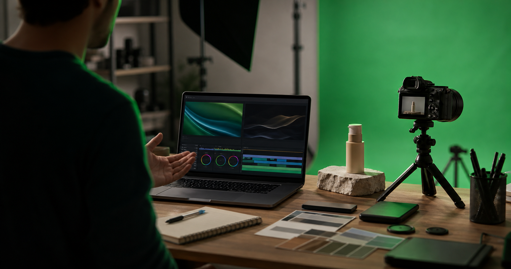
Green screen is attractive because it promises freedom. Record a product founder, trainer, or support specialist in a small room, replace the background later, and ship clean explainer assets without booking a studio. For small teams, that can be the difference between publishing a demo this week and postponing it for another month.
The hard part is not removing the green background. Most editing tools can do a rough key. The hard part is cleaning the evidence that the green screen was there: green edges around hair, green reflections on glossy products, dull skin tones, muddy shadows, and thin halos that become obvious once the frame is used as a landing page thumbnail or help center image.
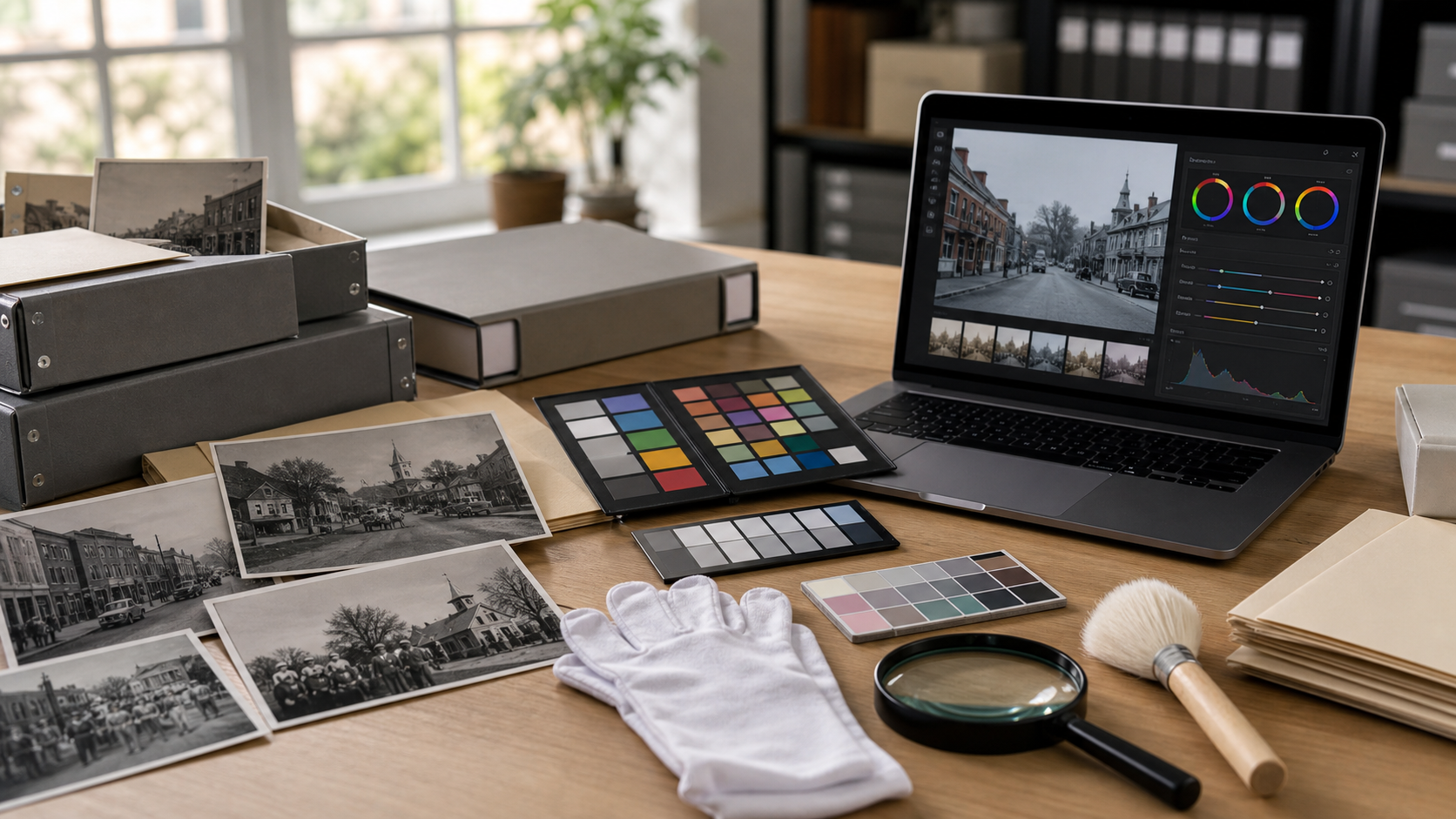
This guide focuses on still frames and short product explainer assets: thumbnails, support article images, email preview graphics, short demo GIFs, and social cutdowns. The goal is practical cleanup, not cinema-grade compositing. You want assets that look trustworthy, readable, and consistent across your site without spending an afternoon on each frame.
For teams that already publish visual support content, the cleanup often happens across several tools. You might pull a frame from a video, repair edges in an editor, resize it for documentation, compress it for page speed, and convert it into the format your CMS prefers. ConvertAndEdit can help with pieces of that chain, including AI photo edits, image resizing, image compression, image conversion, and lightweight demos with the GIF maker.
When Green Screen Spill Is Worth Fixing
Not every green edge deserves attention. If the asset is a tiny internal training thumbnail, a minor fringe may never matter. If the image sits above the fold on a product page, appears in a sales deck, or anchors a help article, spill cleanup can change how professional the whole page feels.
The key is to judge the image by its final use, not by how it looks zoomed to 400 percent. A small amount of edge color may disappear once compressed and displayed at 600 pixels wide. A green reflection on a white device, however, can stay visible at any size because it changes the perceived product color.
Use this quick priority check:
| Asset type | Cleanup priority | What to inspect first |
|---|---|---|
| Landing page thumbnail | High | Face edges, product edges, background realism |
| Help center article image | Medium to high | Readability, neutral color, compression artifacts |
| Email preview image | Medium | File size, edge clarity, brand consistency |
| Social demo still | Medium | Skin tone, contrast, motion crop safety |
| Internal training frame | Low to medium | Only fix distracting color problems |
A good rule: fix spill when it changes meaning, reduces trust, or distracts from the product. Ignore tiny imperfections that only appear during forensic inspection.
The Five Spill Problems That Matter Most

Green screen cleanup becomes easier when you name the problem correctly. Many teams treat every issue as an edge problem, but spill can affect the whole image.
1. Green Edge Fringing
This is the classic neon outline around hair, shoulders, hands, glasses, or product corners. It happens when the green background reflects onto the subject or when the keying tool leaves semi-transparent pixels behind.
Edge fringing is most visible against light neutral backgrounds. A frame that looks acceptable on a dark preview can look sloppy on a white documentation page.
2. Reflective Product Tint
Glossy products pick up green from the backdrop. This affects laptops, phones, packaging, bottles, screens, polished tools, and anything wrapped in clear plastic.
This problem is easy to miss because the product may still look sharp. The issue is color credibility. A black device can look slightly sickly. A white product can look cheap or damaged. A silver object can become dull and greenish.
3. Shadow Contamination
If the subject stands too close to the screen, shadows can mix with green light. After background removal, those shadows may look gray-green, dirty, or detached from the new background.
Bad shadow cleanup is one reason product explainers feel pasted together. The subject may have a clean edge but no believable contact with the scene.
4. Hair and Fabric Transparency
Fine hair, mesh fabric, lace, translucent plastic, and glass are difficult because they are not solid edges. Automatic removal can either leave green residue or cut away too much detail.
For product content, this often appears around curly hair, hoodie drawstrings, eyeglass frames, cables, and transparent packaging.
5. Background Color Cast
Sometimes the entire subject has a green cast, not just the edges. Skin can look flat. White shirts can look mint. Gray products can look unbalanced.
This is especially common in small rooms with green fabric close to the subject, overhead lighting, or reflective walls.
Capture Choices That Reduce Cleanup Later
You can fix a lot after recording, but small capture changes save the most time. If your team records explainers regularly, create a simple pre-shoot checklist and keep it near the camera.
Move the Subject Away from the Screen
Distance is the cheapest spill reduction tool. Even a few extra feet between subject and screen can reduce reflected green light. If the room is tight, pull the subject forward and crop tighter later.
For talking-head product explainers, prioritize distance behind the presenter over showing the full body. A clean waist-up shot is usually more useful than a full-height shot with green contamination everywhere.
Light the Screen and Subject Separately
The green screen should be evenly lit, but the subject should not be flooded with green bounce. Use separate lights when possible: soft, even light for the screen, and controlled key light for the subject.
Avoid placing bright lights so they hit the screen and bounce directly back onto the presenter or product. If you see green on cheeks, hair, packaging, or device edges while recording, it will still be there during editing.
Keep Reflective Products Off the Green Plane
Do not place glossy products directly in front of the screen unless necessary. Angle them slightly so they reflect a neutral wall, table, or white card instead of the green backdrop.
For products with screens, record one version with the product screen off and one with the screen content visible. Reflections are easier to manage when you have options.
Use a Neutral Wardrobe and Table Surface
Green-adjacent clothing, shiny synthetic fabrics, and reflective tables create extra cleanup problems. Neutral matte surfaces are friendlier. If your presenter wears glasses, check the lenses before recording. A clean key can still fail if the glasses reflect a green rectangle.
Record a Few Clean Hold Frames
At the start or end of each take, ask the presenter to hold still for a few seconds. These frames become useful thumbnails because there is less motion blur, cleaner edges, and more room for careful editing.
A still frame with calm posture usually cleans better than a mid-sentence frame with motion-blurred hands.
Pick the Right Frame Before You Edit
The best cleanup often starts by rejecting the wrong frame. A frame with an expressive gesture may be tempting, but if the hand is blurred, hair is moving, and the product catches green glare, it can consume far more editing time than a quieter moment.
Look for frames with:
- Sharp eyes and product details
- Minimal motion blur around hands
- A small gap between hair or shoulders and the green screen
- Neutral reflections on glossy surfaces
- A pose that still makes sense after cropping
- Enough space for the final layout
Avoid frames where:
- Hair blends into deep green shadows
- The product edge is the same brightness as the screen
- Fingers are splayed with heavy blur
- Glasses reflect a bright green panel
- The subject touches the screen or backdrop wrinkles
If the frame will become a thumbnail, test it at the size people will actually see. A frame that looks dramatic full-size may become confusing at small sizes.
A Practical Cleanup Pass for One Hero Frame
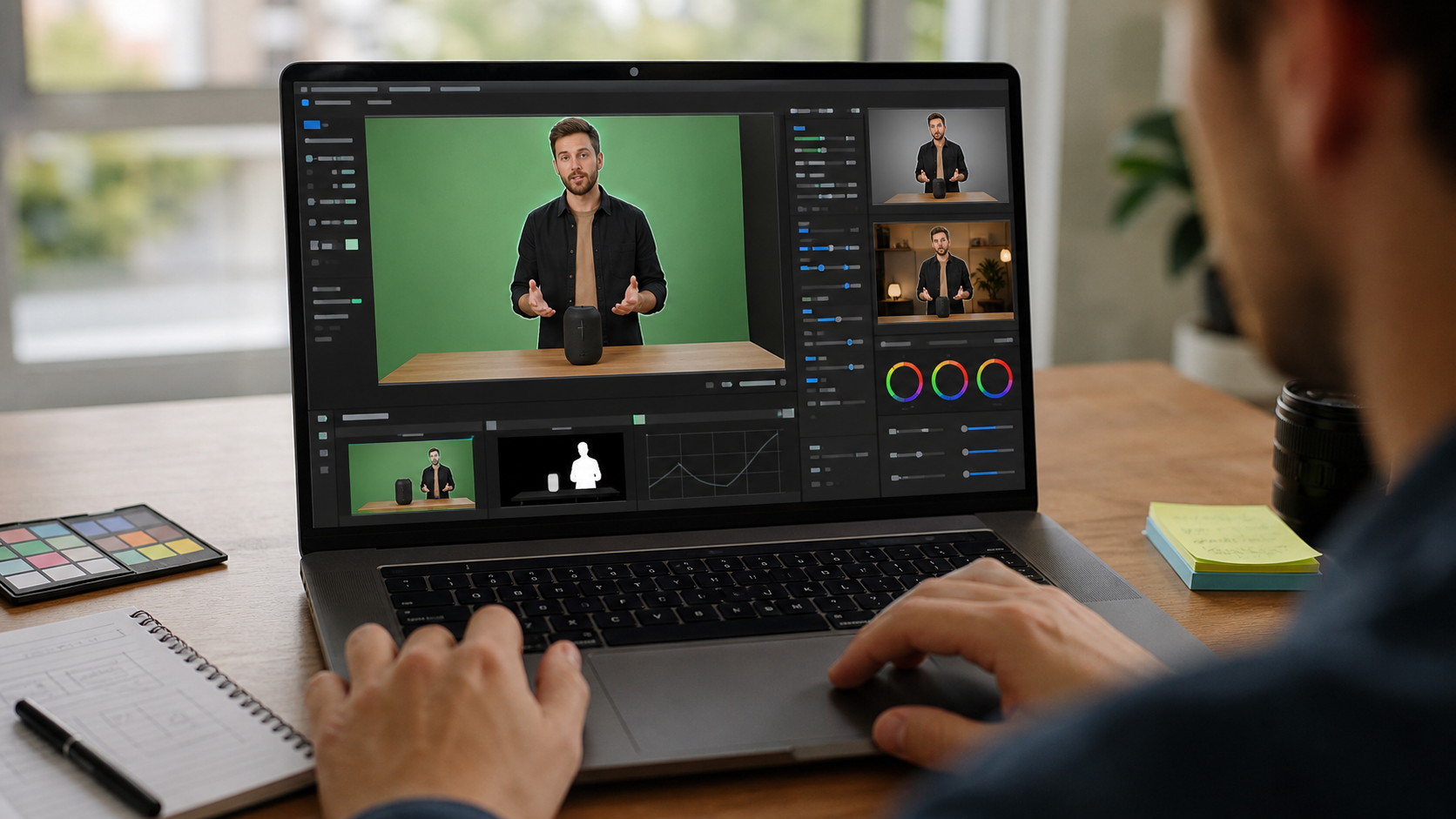
This pass is designed for a single important still: a video thumbnail, article header image, app store style preview, sales deck image, or product education graphic.
Step 1: Remove or Replace the Background
Start with the broadest edit: remove the green background or replace it with the intended final background. Do this before detailed color cleanup because edge problems change depending on what sits behind the subject.
A pale gray background reveals green halos quickly. A warm off-white background may make skin look more natural. A brand-color background can hide some issues but exaggerate others.
If you are using AI photo editing, describe the final scene plainly. For example: replace the green screen with a softly lit neutral office wall, keep the presenter and product unchanged, preserve realistic shadows, remove green color spill from edges. The goal is a believable edit, not a dramatic transformation.
Step 2: Neutralize the Edge Color
After the background is in place, inspect the outline around hair, shoulders, hands, cables, and product corners. You are looking for pixels that remain green or cyan compared with nearby natural tones.
For manual tools, use defringe, color decontamination, selective hue adjustment, or edge refinement. For AI-assisted tools, ask for targeted cleanup: remove the green halo around the subject while preserving hair detail and product shape.
Do not over-clean. If hair becomes helmet-like or product corners become rounded, the repair is worse than the spill.
Step 3: Correct Skin and Product Color
Once edges are acceptable, evaluate the full subject. Compare areas that should be neutral: white shirts, gray devices, silver laptops, paper labels, table surfaces, and eyes.
If those areas lean green, reduce green saturation or shift tint slightly toward magenta. Keep the correction subtle. Strong magenta correction can make skin look sunburned and gray products look purple.
For product explainers, product color accuracy matters more than decorative color grading. If a device, package, or sample is the focus, protect its real color.
Step 4: Rebuild a Believable Shadow
A subject without a shadow can look pasted onto the background. A contaminated green shadow can look dirty. The right solution depends on the final background.
For a neutral studio-style background, a soft contact shadow under the product and presenter is often enough. For a help center screenshot-style image, you may not need a strong shadow at all.
Keep shadows soft, low contrast, and directionally consistent. If the key light comes from the upper left, the shadow should not fall sharply in a different direction.
Step 5: Resize for the Real Destination
Do not judge the final asset only at source resolution. Resize it to the actual size needed for your CMS, help center, email, or social channel. ConvertAndEdit's resize image tool is useful for quickly checking whether fine edge issues still matter at final dimensions.
For a blog or help article, you may need a wide image. For an email preview, you may need a smaller, compressed version. For a changelog card, the image may be cropped into a fixed rectangle.
Step 6: Compress Without Destroying Edges
Compression can expose or hide spill. Heavy compression may smear hair edges, create blocks around the subject, or turn a subtle halo into a visible band. Before publishing, run a file-size pass with image compression and inspect the result at normal zoom.
If the compressed image looks worse, try a slightly larger file size, a different format, or a smaller display size. Clean edges are often worth a few extra kilobytes on important assets.
Decision Table: Keep, Repair, or Reshoot
Some green screen frames are not worth rescuing. This table helps decide what to do before spending too much time.
| Problem | Keep as is | Repair | Reshoot |
|---|---|---|---|
| Tiny green line around shoulder | If used small | If used large or on white | Rarely needed |
| Green reflection on product face | Rarely | If reflection is mild | If product color is important |
| Hair loses detail after removal | If not prominent | If thumbnail depends on face | If hair is central and messy |
| Glasses reflect green panels | Rarely | If reflection is small | If eyes are hidden |
| Subject shadow looks green | If background is dark | Usually repair | If shadow covers product |
| Motion-blurred hand has green edge | If cropped out | Sometimes | If hand is important |
A reshoot is not failure. For a small team, the cheapest edit may be five extra minutes in front of the camera with better spacing and lighting.
Format Choices for Clean Explainer Assets
After cleanup, choose the output format based on transparency, file size, and where the asset will appear.
PNG
Use PNG when you need transparency, sharp UI edges, or lossless quality. PNG is often good for isolated subjects on transparent backgrounds, but it can create large files for photographic frames.
WebP
WebP is often a strong option for web images because it can keep good visual quality at smaller sizes. It supports transparency, which makes it useful for presenter cutouts or product overlays. If your CMS and audience support it, convert a test image with Convert Image and compare it against PNG and JPEG.
JPEG
JPEG is practical for full-frame images without transparency. It is not ideal for sharp transparency edges, but it can be excellent for hero images with a finished background.
GIF
GIF is limited for color and can make spill more visible because gradients and edges become simplified. Use GIF for short motion demos only when file size and compatibility matter more than color fidelity. If you create a short loop from a cleaned clip or frame sequence, test it in the GIF maker and watch for edge shimmer.
Cropping Without Reintroducing Problems
Cropping is not just layout. It changes what viewers notice. A shoulder halo may be invisible in a wide shot but distracting in a tight crop. A product reflection may become the center of the image after resizing.
Before exporting final versions, create the actual crop variants you need:
- Wide article header
- Square social preview
- 16:9 video thumbnail
- Narrow help center image
- Small email preview
Check each crop for three things: face clarity, product clarity, and edge contrast. If the new background is very light, green fringing becomes more obvious. If the background is saturated, product color shifts can look worse.
For mobile-first assets, avoid placing important product details near the edges. Many cards and templates crop aggressively on small screens. Leave breathing room around faces, hands, and product labels.
Using Subtitles and Still Frames Together
Many small teams reuse the same recording for a video, a thumbnail, a support article, and a short silent demo. If the final asset includes captions or burned-in subtitles, plan the frame around them.
Use video to subtitles when you need text from a product explainer clip, then choose stills that do not fight with caption placement. A clean lower area helps if the frame becomes a muted social clip. A clean upper area helps if your player overlays controls or titles.
Do not place the subject edge directly behind subtitle text. Even a small green fringe can reduce readability when it sits near white captions.
Quality Control Checklist Before Publishing
Use this checklist after the final export, not only inside the editor. The published file is what matters.
- View the image at actual display size.
- Check the subject edge against the final background.
- Inspect hair, glasses, hands, cables, and product corners.
- Confirm white, gray, black, and brand-colored products look neutral.
- Compare compressed and uncompressed versions.
- Test the image on a light page and a dark page if it may appear in both.
- Check mobile crops for cut-off faces, products, and captions.
- Make sure transparent images do not have a hidden green matte.
- Confirm file names are descriptive before uploading.
- Keep the original frame in case you need a different crop later.
A useful final test is to look away for a few seconds, then glance back quickly. If your first impression is the product or presenter, the cleanup is probably good enough. If your first impression is the edge, the shadow, or the strange color, keep editing.
Common Mistakes That Make Spill Cleanup Worse
Over-Smoothing the Subject
Skin smoothing, aggressive denoise, and heavy AI cleanup can hide spill while creating a new problem: the presenter no longer looks real. Product explainers depend on trust. Keep natural texture.
Making the Background Too Perfect
A flawless synthetic background can make the subject look less believable. Slight texture, natural light falloff, and realistic shadow help the frame feel grounded.
Ignoring the Product While Fixing the Person
Many explainers feature a presenter holding or pointing to the product. Teams often clean the face and hair while missing green reflections on the product itself. Viewers may forgive a small hair artifact, but they will notice if the product color looks wrong.
Exporting One Master for Every Placement
One cleaned image rarely fits every destination. A wide hero, square preview, and small email thumbnail need different crops and sometimes different compression settings.
Compressing Before Cleanup
Compression artifacts make edge repair harder. Clean the best available source first, then resize and compress near the end.
A Small Team File Naming System
When several people touch the same assets, naming matters. You do not need a complex structure. You need names that show source, edit status, crop, and format.
A simple pattern works well:
product-demo-green-source-2026-06-28.png
product-demo-clean-hero-1600x900.webp
product-demo-clean-square-1200x1200.png
product-demo-clean-email-800x450.jpg
Use source for untouched frames, clean for edited versions, and include dimensions for final exports. This prevents accidental uploads of rough green screen frames and makes it easier to replace assets later.
Example: Turning One Recording Into Three Assets
Imagine a support team records a 90-second explainer showing how to connect a small hardware device to an app. The presenter stands in front of a green screen holding the device.
The team needs three assets:
| Destination | Best frame choice | Cleanup focus | Export |
|---|---|---|---|
| Help article header | Presenter holding product at chest height | Natural skin tone, product edge, soft background | WebP, wide crop |
| Email announcement | Product close-up with presenter partially visible | Product color, smaller file size | JPEG or WebP |
| Short demo loop | Three-second gesture showing connection | Edge shimmer, readable motion | GIF or short video asset |
For the header, the team removes the background, replaces it with a neutral office-style backdrop, repairs green hair edges, and resizes the result for the article. For the email image, they crop tighter on the product, fix the green reflection on the device casing, and compress more aggressively. For the demo loop, they avoid frames where the presenter's hand moves quickly because blur makes edge shimmer harder to hide.
This is the practical mindset: each asset gets only the cleanup it needs for its job.
Final Thoughts
Green screen spill cleanup is not about chasing a perfect mask. It is about protecting the viewer's attention. In product explainers, the viewer should notice the feature, the device, the presenter, or the instruction, not the production setup behind the scene.
Small teams can get strong results by choosing better frames, fixing the most visible spill first, protecting product color, and exporting separate versions for real placements. A few disciplined checks before publishing can make simple recordings feel polished across landing pages, help centers, emails, and short demos.