Laser-Engraved QR Plaque Image Preflight: A Practical Guide for Durable Scans
Prepare QR plaque artwork for laser engraving with cleaner contrast, safer sizing, proof PDFs, and scan checks before metal, acrylic, wood, or laminate production.
Laser-Engraved QR Plaque Image Preflight: A Practical Guide for Durable Scans
Laser-engraved QR plaques look simple until they fail in the real world. A code that scans instantly on a backlit phone screen can become unreliable after it is etched into brushed steel, burned into wood grain, cut into black acrylic, or printed on a small laminate tag. The problem is rarely the QR code itself. It is usually the image preparation around it: contrast, quiet zone, output size, file format, proofing, and whether anyone tested the final artwork under the same conditions as the plaque will be used.
This guide is for small teams preparing durable QR plaques for equipment labels, museum objects, office signage, rental units, event installations, warehouse shelves, repair stations, and public-facing instructions. It focuses on the image file before production, not on a specific engraving machine brand. The goal is to prepare plaque artwork that a vendor, maker space, or in-house laser operator can use with fewer surprises.
You do not need complex layout software for every small plaque run. A careful source image, a clean export, and a proof PDF can prevent most scanning failures. ConvertAndEdit tools can help with practical file steps such as resizing artwork with /resize-image, changing formats with /convert-image, packaging proofs with /image-to-pdf, and checking small label text with /image-ocr when your plaque includes human-readable IDs.
Why QR Plaques Fail After Engraving
QR codes are designed to tolerate some damage, but engraving adds failure modes that a normal digital export does not show. A laser can widen dark modules, soften tiny corners, burn unevenly across grain, or create glare that makes the code look lower contrast to a phone camera. Even if the code is mathematically valid, the physical version may not scan reliably.
The most common failures are practical rather than mysterious:
- The code was exported too small, then scaled up or down during production.
- The quiet zone around the code was cropped, decorated, or crowded by a border.
- The plaque material reduced contrast between engraved and unengraved areas.
- Fine modules filled in because the laser kerf was too large for the code size.
- A glossy surface produced reflections over key finder patterns.
- The proof was checked only on a screen, not at printed physical size.
- The code was embedded in a busy design where the camera could not isolate it quickly.
A good preflight process treats the QR code as a machine-readable object first and a design element second. The plaque can still look polished, but the scannable area needs discipline.
Choose the Right QR Payload Before Editing Images
Image cleanup cannot rescue a bloated QR code that was generated with too much data. Before touching image tools, decide what the code should contain.
Short URLs are usually better than long URLs. A short destination creates a less dense QR pattern, which means larger modules at the same physical plaque size. Larger modules are easier to engrave cleanly and easier for phone cameras to read from an angle. If you need analytics, redirects, or future destination changes, use a managed short URL or a permanent redirect under a domain you control.
Avoid packing long instructions, full contact cards, or multi-parameter tracking links directly into the code unless there is a strong reason. Dense codes are harder to engrave, especially on textured materials.
A practical rule: if the plaque will be small, outdoors, touched often, viewed at an angle, or engraved on a material with imperfect contrast, keep the encoded data as short as possible.
Start With Vector When Possible, Raster When Necessary
Laser software often prefers vector paths for cutting and engraving, but many teams receive QR codes as PNG, JPG, or screenshots. If you can generate a vector SVG or PDF directly from a QR generator, that is the cleanest starting point. Vector artwork preserves crisp square edges at any size.
If you only have a raster file, make sure it is a high-resolution black-and-white PNG rather than a compressed JPG. JPG compression can introduce gray halos and block artifacts around QR modules. Those artifacts may look harmless on screen, but they can become extra burn marks or fuzzy edges after engraving.
Use /convert-image when you need to move a clean source into a more suitable format. For QR art, PNG is usually safer than JPG because it preserves hard edges and flat color. If your file came from a screenshot, crop it carefully and export it as a clean PNG before resizing.
The Plaque Preflight Checklist
Use this checklist before sending artwork to production. It is intentionally concrete because small plaque problems are easy to miss when every file looks fine on a large monitor.
| Check | What to Look For | Why It Matters |
|---|---|---|
| Payload length | Short URL or compact data | Reduces QR density and improves engraving tolerance |
| Quiet zone | Clear margin on all four sides | Helps cameras detect the code boundary |
| Contrast | Strong difference between engraved and background areas | Improves scan speed under imperfect lighting |
| Module size | Individual squares large enough for the material and laser | Prevents filled-in or broken code cells |
| Export format | PNG, SVG, or production-ready PDF | Avoids compression artifacts |
| Physical proof | Printed at final plaque size | Reveals sizing problems before engraving |
| Scan testing | Multiple phones, angles, and distances | Catches real-world readability issues |
| Human label | Optional short ID or URL near the code | Helps users recover if a scan fails |
The quiet zone deserves special attention. A QR code should have clear blank space around it, typically at least four modules wide. Do not place a border directly against the code. Do not let a logo, screw hole, arrow, decorative line, or plaque edge intrude into that margin.
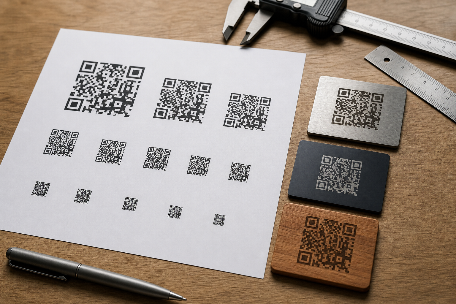
Size the Code for the Viewing Distance
A QR code on a key tag, a machine panel, and a wall sign do not need the same physical dimensions. The farther away the scan starts, the larger the code should be. Plaque material also matters: a high-contrast printed laminate can be smaller than a low-contrast engraving on brushed aluminum.
For close-range plaques, such as equipment tags scanned from 6 to 12 inches away, a code around 0.8 to 1.2 inches wide may work if it is simple and high contrast. For wall signs or installation labels scanned from several feet away, increase the size substantially. When in doubt, test larger. Empty plaque space is cheaper than a support ticket, a return visit, or a re-engraving run.
Use /resize-image to prepare raster artwork at the exact pixel dimensions requested by your vendor or machine setup. Resizing should happen once from a clean source. Repeated scaling can soften edges or introduce uneven module boundaries.
A useful raster target is to keep QR module edges aligned cleanly to pixels. If the code is resized to a dimension that cuts modules into fractional pixels, some squares may become slightly thicker or thinner. That unevenness can carry into the engraving file. When possible, export the QR code from the generator at the needed size rather than stretching it later.
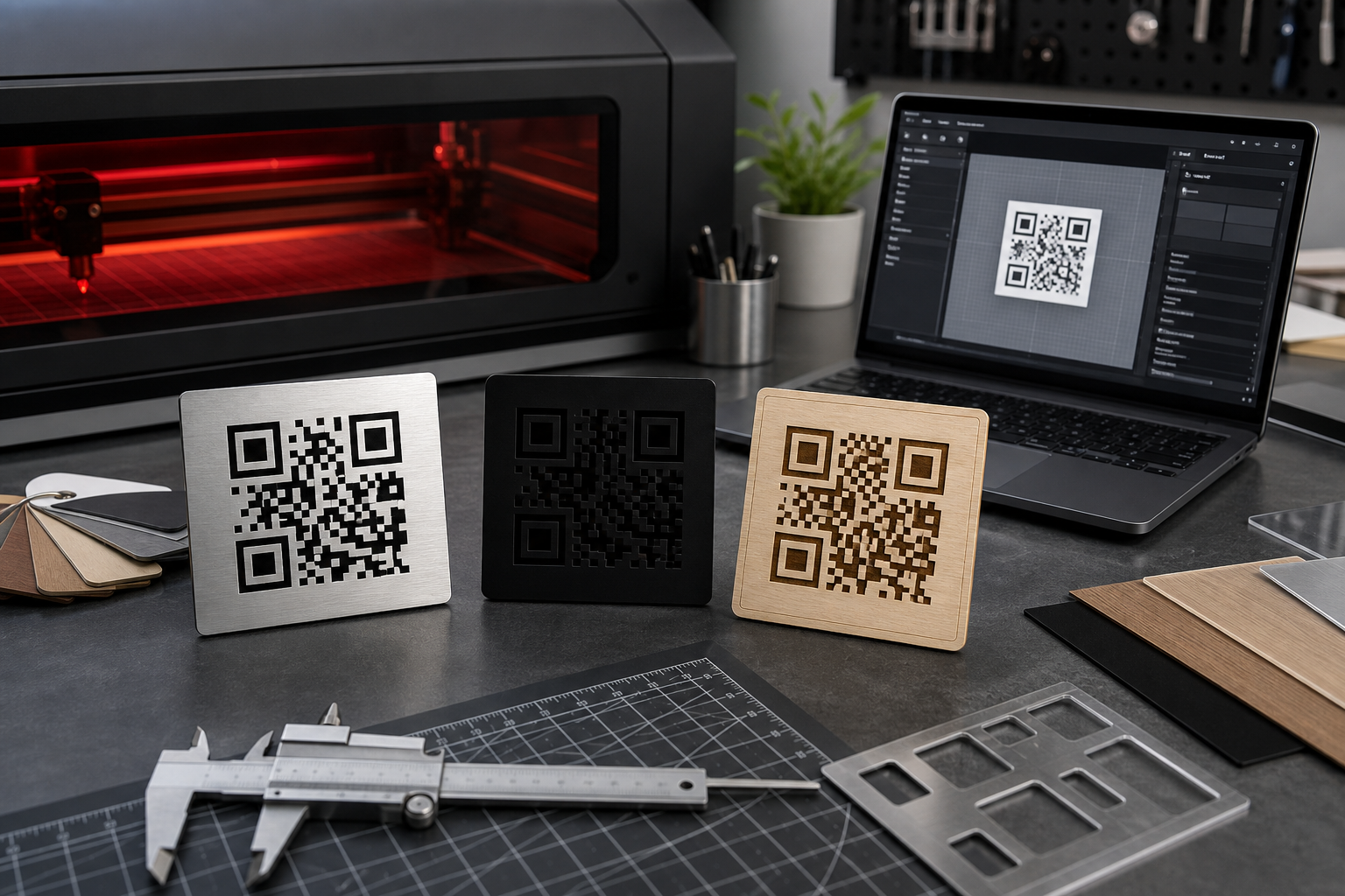
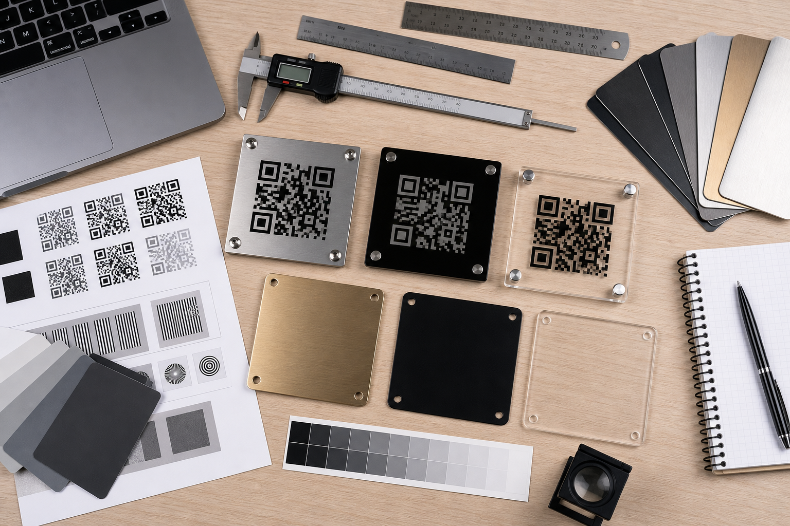
Material-Specific Image Choices
Different plaque materials translate image artwork differently. The same black-and-white QR file may behave very differently on aluminum, acrylic, wood, laminate, or anodized metal.
Brushed Metal
Brushed metal can create directional glare. A code that looks high contrast from straight on may wash out when viewed from an angle. Use generous sizing and strong contrast. If the engraving appears silver-on-silver, consider whether a filled dark mark, blackened engraving compound, or anodized surface is more appropriate.
Keep decorative borders away from the QR quiet zone. Reflections along a border can confuse phone cameras, especially when the plaque is mounted near windows or bright overhead lighting.
Black Acrylic
Black acrylic can produce crisp marks when engraved, but it may also show dust and fingerprints. If the engraved area is light against a black background, test whether the phone camera consistently reads the light modules as the intended contrast. Some QR setups assume dark modules on a light background. Inverted QR codes can work, but they are less forgiving across scanner apps and lighting conditions.
For public or mixed-device use, standard dark-on-light contrast is usually safer. If the plaque design requires a dark base, consider a light insert area for the code.
Wood
Wood grain is beautiful and risky. Grain lines can create uneven contrast inside the code. Burn marks can spread, especially on softer woods, making small modules merge. Use larger codes, lower density payloads, and proofs on the same wood species when possible.
Avoid placing the QR code across dramatic grain changes, knots, or burned decorative textures. The code area should be visually calm even if the rest of the plaque is rustic.
Laminate and Printed Tags
Printed laminate tags can preserve code detail well, but compression and print scaling still matter. Use crisp PNG or PDF output and avoid JPG. If the tag includes a small human-readable URL or asset ID, check it with /image-ocr after export or after photographing a sample. OCR is not a substitute for human review, but it can quickly reveal whether tiny printed text has become too soft.
Contrast Is More Than Black and White
On screen, contrast is obvious: black squares on white background. On a plaque, contrast depends on reflectivity, texture, depth, lighting, and viewing angle. A shallow engraving may be readable in a product photo but weak in a hallway. A glossy plaque may scan in shade but fail under direct light.
Think in terms of camera contrast, not designer contrast. The phone needs to distinguish the modules quickly. If the background and engraved marks reflect similar amounts of light, the code may hunt, blur, or scan only after the user tilts the phone.
Before production, simulate the intended contrast as simply as possible. Print a proof at final size in grayscale. View it under office light, window light, and dim light. Then scan it at the distance a real user will use. A paper proof is not the same as metal or acrylic, but it can expose obvious size and density mistakes before material tests.
Build a Proof PDF Before You Engrave
A proof PDF gives everyone a shared reference: designer, operations manager, vendor, installer, and reviewer. It should show the QR code at final physical size, the plaque outline, screw holes or mounting area if relevant, and any nearby human-readable label.
For small runs, you can create proof images for each plaque, then package them with /image-to-pdf. If the artwork is spread across multiple image files, a single PDF is easier to review than a folder of loose PNGs. It also helps prevent accidental mixing of old and new code versions.
A good proof PDF should include:
- One plaque per page when precision matters.
- Final physical dimensions stated in the surrounding project notes or filename.
- Enough margin to see the quiet zone clearly.
- The destination URL or asset ID outside the code area for human verification.
- A revision date or batch label in the file name, not inside the QR quiet zone.
Do not rely only on a screen review. Print the PDF at 100 percent scale, measure the code with a ruler or calipers, and scan it. If the print dialog scales to fit, the proof may become misleading. Use actual size settings where available.
Add Human-Readable Recovery Information
A QR plaque should not depend entirely on the camera. If space allows, include a short human-readable fallback: a short URL, asset ID, room code, or serial number. This is especially useful for equipment labels, public instructions, and long-lived installations.
Keep the fallback text outside the QR quiet zone. It should be near enough to feel connected, but not so close that it becomes part of the camera’s detection area. Use a plain typeface, enough size, and strong contrast. Tiny engraved text can fill in or become hard to read on textured surfaces.
If you receive a sample photo from a vendor, run the text area through /image-ocr as a quick sanity check. If OCR struggles with a clean sample photo, a tired user in poor lighting may struggle too.
Avoid Decorative Damage
Designers often want to customize QR codes with logos, rounded modules, gradients, cutouts, or brand patterns. Some digital QR codes tolerate that, but engraved plaques are less forgiving. Every decorative change reduces the margin for material variation.
For durable plaques, keep the code plain. Avoid gradients, shadows, textured fills, low-contrast brand colors, and module rounding. If a logo is required, place it outside the QR code instead of in the center. If brand styling is important, style the plaque area around the code, not the code itself.
Borders need care too. A border can make a plaque look finished, but it should sit well outside the quiet zone. A tight border may be interpreted as part of the code or may make the blank margin appear smaller to the scanner.
File Naming for Small Plaque Batches
File naming is not glamorous, but it prevents expensive mistakes. QR plaques often connect physical objects to digital destinations. A swapped file can send users to the wrong manual, form, room page, or asset record.
Use names that connect the artwork to the destination or object without becoming unreadable. For example:
plaque-room-214-maintenance-qr-v03.png
asset-a17-filter-panel-qr-proof-2026-05.pdf
museum-case-08-audio-guide-qr-final.png
Avoid names like qr-final-final.png or new-code.png. If the destination changes, increment the version. Keep retired files out of the production folder. For mixed image types, /convert-image can help standardize files into the format your vendor expects before packaging.
Scan Testing That Actually Proves Something
A successful scan at your desk is a start, not a complete test. Plaques live in awkward places: near reflective glass, above shoulder height, in dim utility rooms, on curved equipment, beside bright windows, or in public areas where users scan quickly.
Test with conditions that resemble the final installation:
- Scan from the expected user distance.
- Scan at slight angles, not only straight on.
- Use at least two phone models if available.
- Try bright, dim, and side lighting.
- Test a printed proof at final size before engraving.
- Test an engraved sample before approving a full batch.
- Confirm the destination page loads on mobile data, not only office Wi-Fi.
If the code scans only after careful positioning, enlarge it or simplify it. Public-facing plaques should scan with casual effort.
Decision Table: What to Change When a Plaque Fails
When a test plaque fails, do not change everything at once. Use the symptom to choose the most likely fix.
| Symptom | Likely Cause | Practical Fix |
|---|---|---|
| Scans on screen but not engraved | Material contrast or module damage | Increase size, improve contrast, test material settings |
| Scans only very close | Code is too small or too dense | Shorten payload, enlarge code, use a cleaner export |
| Scans from one angle only | Glare or reflective surface | Change finish, rotate placement, increase contrast |
| Finder corners look muddy | Laser burn spread or low resolution source | Use vector or higher-resolution PNG, reduce burn spread |
| Some phones scan, others fail | Marginal readability | Increase quiet zone and size, avoid inverted styling |
| Text label unreadable | Text too small or engraving fill-in | Increase type size, simplify font, improve contrast |
This table is also useful when discussing revisions with a vendor. Instead of saying the code “does not work,” you can describe the failure in terms that point to a specific production adjustment.
Where ConvertAndEdit Fits
ConvertAndEdit is useful for the practical file preparation around plaque production. It does not replace a QR generator, a laser operator, or a material test, but it helps clean up the image handoff.
Use /resize-image when you need a raster QR or plaque image at a specific pixel size. Use /convert-image to avoid sending compressed or unsuitable formats. Use /image-to-pdf to create review packets that can be printed at final size. Use /image-ocr to check whether small fallback labels remain legible in exported images or sample photos. If a product photo or plaque mockup needs cleanup before documentation, /ai-photo-editor can help remove visual distractions, though the actual QR code artwork should stay plain and machine-readable.
The key is to separate production artwork from presentation images. The QR code sent for engraving should be clean, flat, and technically boring. Photos used in manuals, proposals, or recap pages can be edited for clarity after the production file is approved.
A Practical Preflight Sequence
For a small plaque batch, use this sequence:
- Generate the QR code from the shortest stable destination you can use.
- Export as SVG when possible, or as a high-resolution PNG.
- Confirm the quiet zone is intact on all sides.
- Decide the physical plaque size and expected scan distance.
- Resize raster artwork only once from the cleanest source.
- Place the code into the plaque layout with generous margin.
- Add a short human-readable fallback outside the quiet zone.
- Create a proof PDF and print it at 100 percent scale.
- Scan the proof with multiple phones and lighting conditions.
- Engrave one material sample before approving the full batch.
- Photograph the sample and verify both scan behavior and label legibility.
- Archive the approved source, proof PDF, and final production file together.
This sequence is deliberately simple. The value is not in adding more software; it is in catching the predictable mistakes before they become physical objects.
Final Checks Before Sending Files
Before you send the files to a vendor or laser station, pause for a final review. Open the production file and the proof PDF. Confirm that the code version is current, the destination is correct, and the file name matches the object or location. Check that no border, label, screw hole, or decorative element has entered the quiet zone. Make sure the code is not a screenshot pasted into a larger design at a strange scale.
Then scan one last printed proof. If the proof is hard to scan, the plaque will not become easier after engraving. Fix the image now, while the cost is still only a file revision.
Durable QR plaques are a bridge between physical spaces and digital content. Treating the QR image as production-critical artwork gives that bridge a much better chance of working for years, across phones, lighting, materials, and users who will not know how much preparation went into a simple square code.