Mobile Error State Screenshot Packs for Support Macros: A Practical Readability Audit
Build cleaner mobile error state screenshot packs for support macros: crop consistently, protect readable UI text, remove noise, and package images without bloated files.
Mobile Error State Screenshot Packs for Support Macros: A Practical Readability Audit
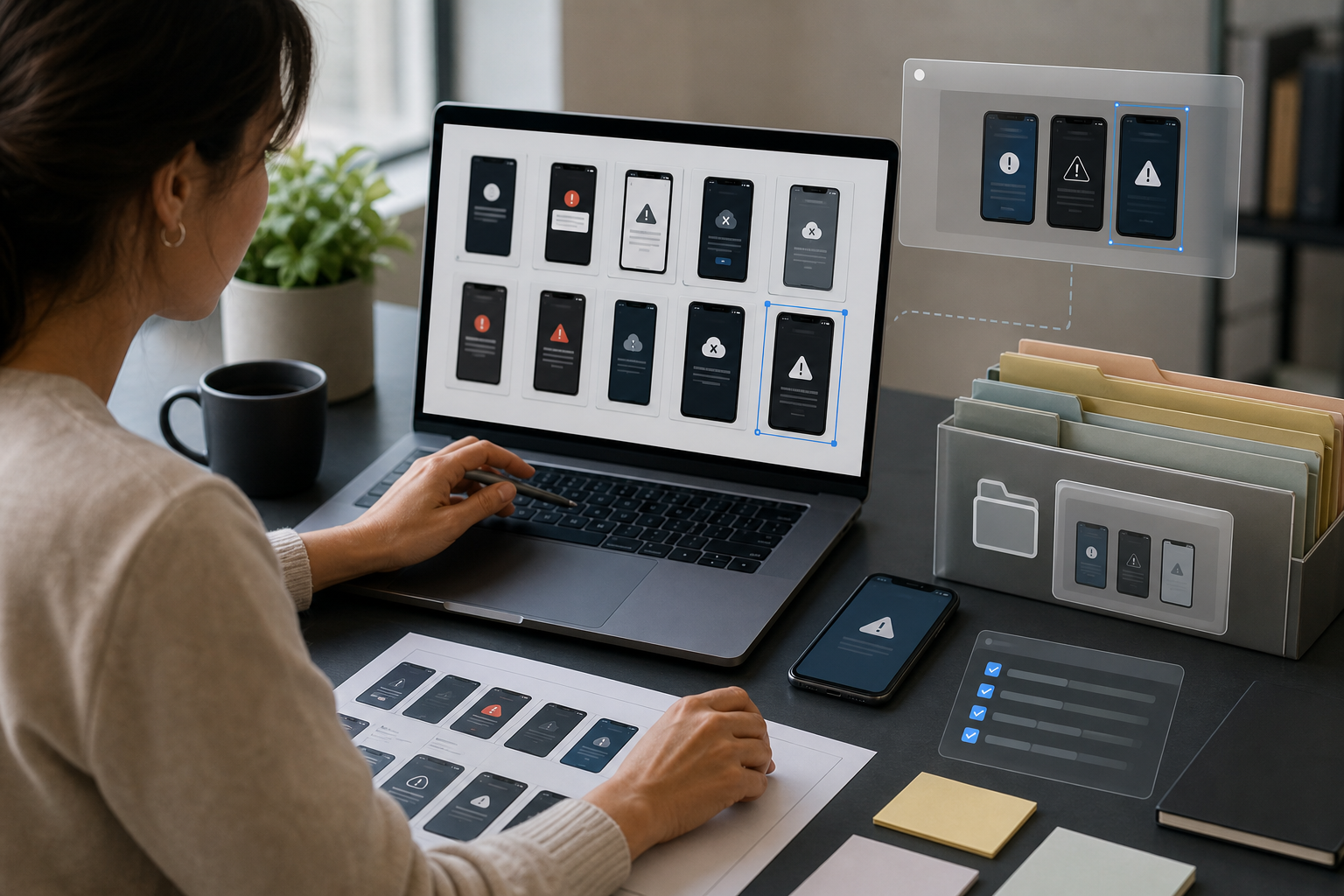
Support teams often treat screenshots as quick attachments: grab the phone, capture the error, paste it into a macro, and move on. That is fine for a one-off conversation. It becomes a problem when the same blurry, oversized, inconsistent screenshots are reused across hundreds of replies, help center snippets, bug escalations, and internal training pages.
Mobile error states are especially fragile. A login screen can look readable on the agent's desktop but collapse into mush when inserted into a support tool. A permission prompt may include tiny system text that matters more than the app UI. A payment failure state might need the surrounding steps, not just the red alert. If the image is too tall, the customer scrolls past the important part. If it is cropped too tightly, the agent loses context and chooses the wrong macro.
This guide is for support operations, product support, QA, and documentation teams that maintain reusable screenshot packs for mobile app issues. The goal is not to make screenshots pretty. The goal is to make them consistent, readable, small enough to load quickly, and reliable enough that an agent can trust them during a busy queue.
ConvertAndEdit tools can help with the practical pieces: crop and resize images, compress heavy screenshots, convert formats, extract text with OCR, and package image sets into PDFs when a review packet is easier than a folder of files. The judgment still comes from the team. The audit below gives you a practical system for deciding what to capture, what to remove, how to size it, and when to rebuild a screenshot instead of patching an old one.
Why Support Macro Screenshots Need Their Own Standard
A screenshot used in a macro is not the same as a screenshot used in a release note or a bug report. It has a different job.
In a bug report, the screenshot proves that something happened. In a help center article, it teaches a user where to click. In a support macro, it often does something more specific: it helps the agent choose the right reply and helps the customer recognize the exact state they are seeing.
That means the screenshot pack must answer practical questions quickly:
- Is this the same error the customer reported?
- Which app version or screen family does it belong to?
- Does the customer need to retry, update permissions, change payment details, or contact support?
- Is the image still accurate after the latest mobile release?
- Can the important text be read inside the support platform, not only in a local image viewer?
Without standards, teams accumulate screenshot debt. Old captures remain in macros after the app UI changes. Images from different devices mix together, so spacing and navigation bars jump from one macro to the next. Some screenshots include private test data. Some are full-height captures where the relevant error occupies 8 percent of the image. Others are so aggressively compressed that the error message cannot be read.
A screenshot pack standard reduces this drift. It also makes reviews faster because reviewers are checking against a shared checklist instead of debating image taste.
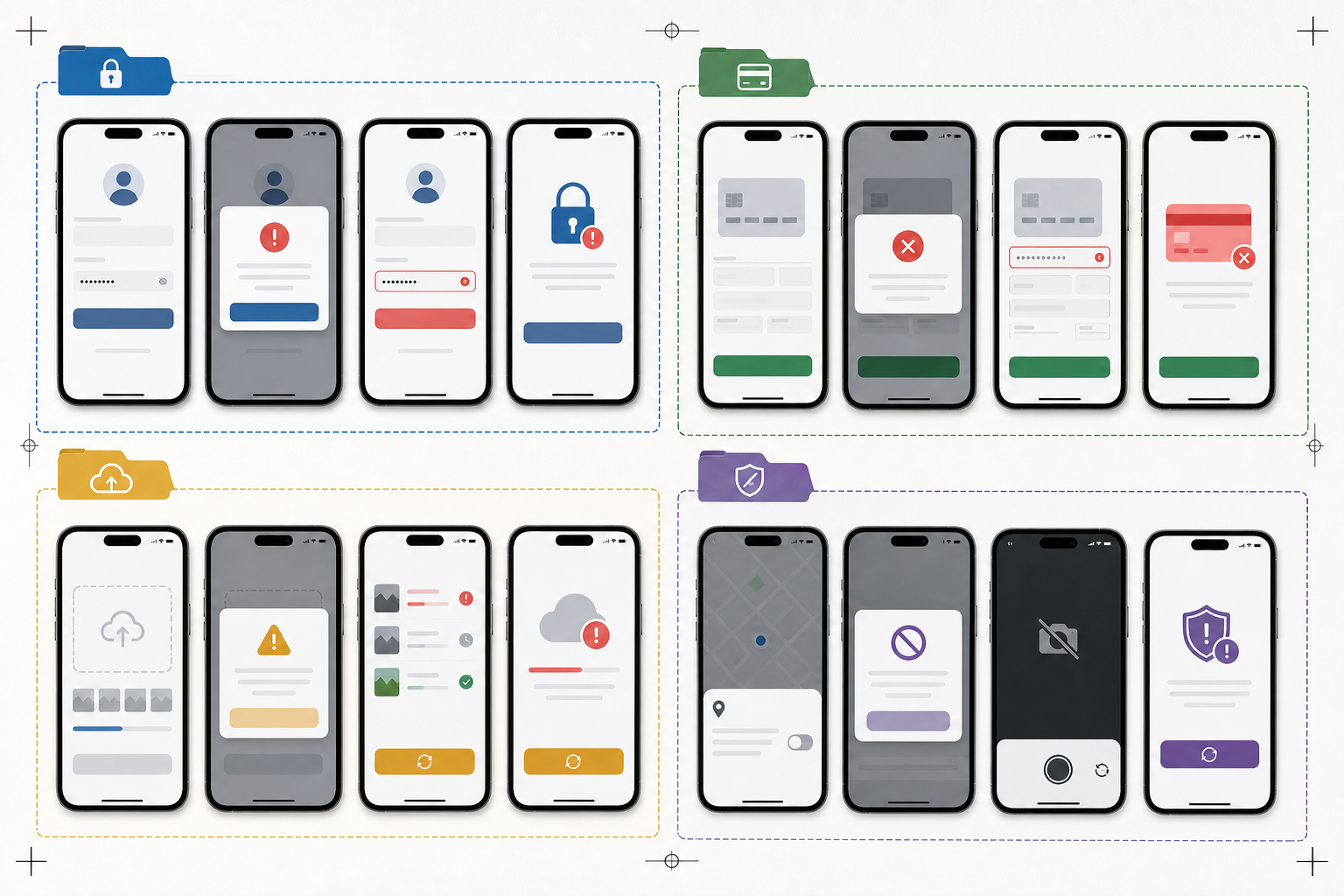
Choose Error States Worth Capturing
Do not start by capturing every unhappy path in the product. Start with error states that are reused in agent replies or misidentified in tickets.
Good candidates include:
- Login failures that look similar but require different answers
- Two-factor authentication errors and recovery states
- Subscription, billing, renewal, or payment problems
- Upload failures caused by file size, format, or connection issues
- Permission prompts for camera, microphone, location, contacts, or notifications
- Empty states that users mistake for data loss
- Offline and poor-connection states
- Account lock, fraud review, or verification pending screens
- App update required screens
- Region, language, or compliance restrictions
Avoid screenshot packs for states that change constantly or contain sensitive details that are hard to scrub. If the visible state depends on a real customer's account, rebuild it with a test account or document it internally without embedding it in customer-facing macros.
A useful rule: if an agent must distinguish between two visually similar screens before choosing a reply, capture both screens and name them clearly. If the screen is obvious and rare, a text description may be enough.
The Minimum Capture Set
For each error family, capture a small but complete set. The mistake is capturing only the final red error message. Many mobile issues depend on the screen immediately before the error and the recovery option immediately after it.
A reliable set usually includes:
| Capture | Purpose | Keep It? |
|---|---|---|
| Entry screen | Shows where the user begins | Keep if agents need context |
| Error state | Shows the exact message or blocked action | Always keep |
| Expanded details | Shows secondary help text, if hidden behind a drawer or link | Keep when it changes the answer |
| Recovery action | Shows the next useful button or setting | Keep for customer-facing guidance |
| System prompt | Shows iOS or Android permission language | Keep if permissions are involved |
| Success state after recovery | Confirms the fix path | Keep for training, optional for macros |
For a password reset issue, the minimum pack might be three images: the reset request screen, the invalid or expired link error, and the screen where the user requests a new link. For an upload failure, it may need four: file picker, selected file, error message, and the accepted format hint.
Keep the set narrow. Macro screenshots should not become a storyboard of the entire feature. A support agent needs the state, the reason, and the next step.
Capture Rules That Prevent Rework
Clean output starts before editing. A bad capture can be improved, but it is usually faster to recapture than to rescue it.
Use a dedicated test account with safe, boring sample data. Avoid names, email addresses, phone numbers, order numbers, medical details, payment fragments, access codes, and addresses. If the app cannot show the error without sensitive data, use a staging build or a seeded internal account.
Set the device to a predictable state:
- Use the same device family for a full pack when possible
- Turn on a neutral system appearance unless the macro is about dark mode
- Hide personal notifications before capturing
- Use the same language and region as the macro audience
- Set text size to the default unless accessibility text size is the subject
- Avoid low battery, hotspot, recording, or focus mode icons unless relevant
- Disable keyboard suggestions if they expose personal data
Capture at native resolution. Do not screenshot a screenshot inside a chat app, browser preview, or desktop mirroring window if you can avoid it. Each extra layer adds blur, scaling artifacts, and sometimes compression.
When you need both iOS and Android examples, keep them as separate packs. Mixing platforms in one macro is only useful when the customer must choose between instructions. Otherwise, it creates visual noise.
Crop for Recognition, Not Decoration
Cropping mobile screenshots is a balance between context and readability. Too much phone chrome wastes space. Too little context makes the screen harder to recognize.
For support macros, the best crop usually includes:
- The app header or enough navigation context to identify the screen
- The error message and the action that caused it
- The primary recovery button, link, or field
- Relevant system permission text, if the error is controlled by the operating system
Remove areas that do not help the agent or customer:
- Blank lower screen space below the action area
- Full notification trays unless the issue involves notifications
- Personal status bar details when not relevant
- Repeated rows in long lists
- Decorative app content around the error
Use consistent aspect ratios inside the same pack. If every screenshot has a different height, macros feel jumpy and support review becomes slower. You can use /resize-image to standardize exported dimensions after cropping, especially when a support tool displays images in a fixed-width column.
A practical sizing target for many macro libraries is 900 to 1200 pixels wide for detailed mobile screenshots. This gives enough resolution for small UI text while avoiding massive files. If the image will be embedded inline in a narrow support editor, also test a smaller rendered size. A screenshot that is technically high resolution can still be unreadable when displayed at 360 pixels wide.
Marking Important Areas Without Making a Mess
Annotations can help, but mobile screenshots become crowded quickly. A red rectangle around every important element teaches the viewer to ignore all rectangles.
Use annotations only when they reduce ambiguity. Good annotation candidates include:
- A tiny error link that is easy to miss
- A specific setting toggle in a system permissions screen
- The exact field causing validation failure
- A button label that appears below the visible fold in some devices
Avoid annotations for obvious centered error messages, large buttons, or screens where the macro text already explains the action.
Keep annotation style consistent:
| Annotation Need | Suggested Treatment | Avoid |
|---|---|---|
| Point to one small item | Thin outline or small arrow | Giant arrows covering UI |
| Compare two states | Side-by-side images | Stacking many callouts on one image |
| Hide private data | Solid blur or block | Transparent blur that still reveals text |
| Show tap target | Subtle ring around the target | Large labels inside the screenshot |
If annotations need to include explanatory text, consider placing that text in the macro body instead of inside the image. Text baked into images is harder to translate, update, and read on mobile.
OCR Check: Make Sure the Image Says What You Think It Says
An OCR pass is a useful quality check for screenshot packs because it catches problems human reviewers miss. If OCR cannot read the error message, customers may struggle too, especially when the image is embedded small or compressed by a support platform.
Use /image-ocr on the final screenshot or on a test export. You are not trying to create a perfect transcript. You are checking whether the critical words survive capture, cropping, resizing, and compression.
Look for these failure signs:
- The main error message is missing from the OCR output
- Similar characters are confused, such as 0 and O, 1 and l, or rn and m
- Button labels disappear after compression
- White text on colored backgrounds is poorly recognized
- Small system permission text becomes a broken sequence of fragments
If OCR fails on the important text, try a less aggressive crop, a wider export, or a cleaner format. Sometimes the issue is not compression but scale. A screenshot reduced too early may never regain crispness.
OCR also helps with asset indexing. A support operations team can keep a simple spreadsheet with the screenshot filename, error family, macro ID, app version, and key OCR text. That makes it easier to find stale screenshots after a release changes copy.
Compression Rules for Thin Mobile UI Text

Mobile screenshots contain thin lines, small labels, antialiased icons, and subtle shadows. Compression can damage all of them. The goal is not the smallest possible file. The goal is the smallest file that keeps the state unmistakable.
Start with the final display need. A macro thumbnail does not need the same file size as a printable training packet. But if the screenshot includes tiny system text, do not crush it just to save a few kilobytes.
Use /compress-image for a controlled pass after cropping and resizing. Review the result at the same size agents and customers will see it. Zooming to 300 percent is less useful than checking the actual support editor view.
A practical decision table:
| Screenshot Type | Preferred Format | Compression Approach |
|---|---|---|
| Standard app UI screenshot | PNG or WebP | Keep edges crisp; moderate compression |
| Screenshot with photos inside the app | WebP or JPEG | Balance photo areas with readable labels |
| Permission prompt or system settings | PNG | Preserve small text and thin controls |
| Annotated screenshot | PNG or WebP | Check annotation edges after export |
| Very large review packet images | WebP or compressed PNG | Test in the destination tool |
If your support platform recompresses uploads, test that platform directly. Upload the image into a draft macro, send a test reply to an internal inbox, and inspect the result on desktop and mobile. Some platforms create thumbnails that look acceptable in the editor but degrade after sending.
Avoid repeated compression. Edit from the original capture, export once, then compress once. If a screenshot has already been through chat, email, and a support upload, recapture or return to the original file.
Format Choices for Macro Libraries
PNG is often the safest default for mobile UI because it preserves hard edges and text well. WebP can be excellent when the support platform handles it reliably. JPEG is acceptable for photo-heavy app screens but can create halos around small text.
Use /convert-image when you need to normalize mixed captures into a consistent format. Do not convert blindly. A PNG screenshot converted to JPEG may become smaller but less readable. A JPEG converted to PNG will not recover lost detail; it may only create a larger file.
For most support macro screenshot packs:
- Use PNG for critical UI text, permission prompts, and annotated examples
- Use WebP for lighter web delivery when your tools and support platform support it
- Use JPEG only when the screen is mostly photographic and text is secondary
- Avoid animated formats unless motion is essential to understand the error
When motion is essential, such as a spinner that fails or a tap that reveals an error, create a short GIF or lightweight clip separately. Do not replace a stable screenshot with animation unless the macro truly needs it. A still image is easier to scan and localize.
Naming, Versioning, and Folder Hygiene
Screenshot packs fail quietly when nobody can tell what is current. File names should be boring and useful.
A solid naming pattern includes product area, platform, error family, state, language, and date or app version:
login-ios-expired-link-error-en-v6-14.png
billing-android-card-declined-recovery-en-2026-05.png
upload-ios-file-too-large-details-en-v6-14.png
Do not use names like Screenshot 2026-05-22 at 10.44.31.png, new-final-final.png, or error2.png. They force reviewers to open every file and guess.
Keep a review note beside each pack:
| Field | Example |
|---|---|
| Product area | Login |
| Platform | iOS |
| Language | English |
| App version | 6.14 |
| Macro IDs | AUTH-RESET-02, AUTH-RESET-03 |
| Owner | Support Ops |
| Last checked | 2026-05-22 |
| Next review trigger | Login UI copy changes |
The review trigger matters more than a fixed calendar date. Some screenshots can remain accurate for a year. Others expire the moment a button label changes.
Packaging for Review and Approval
A folder of images is fine for editing, but reviewers often need a single packet. Product, legal, localization, or support leads may want to scan the whole set and leave comments.
For review, create a simple PDF packet with one screenshot per page or a small grid by error family. You can use /image-to-pdf to package selected screenshots into a reviewable document. If several reviewers need to compare related states, combine PDFs with /pdf-merge after each owner contributes their section.
A review packet should show:
- Screenshot filename
- Platform and app version
- Macro or help article where it will appear
- Whether the image is customer-facing or internal only
- Any known limitation, such as staging copy or pending localization
Keep the final macro assets separate from the review packet. The PDF is for approval and history. The individual optimized images are what the support tool should use.
Redaction and Privacy Checks
Support screenshots are easy places to leak private or misleading data. Even test accounts can contain realistic email addresses, names, message previews, map locations, or transaction fragments.
Before a screenshot enters a macro library, check:
- Status bar notifications
- Account avatars and initials
- Email addresses and usernames
- Phone numbers and recovery contact hints
- Payment card fragments or invoices
- Order IDs, booking references, and shipment data
- Location names and addresses
- Chat previews, push notifications, and clipboard suggestions
- QR codes or barcodes
- Debug identifiers that should remain internal
Prefer recapturing with clean data over redacting. Redaction is useful, but a screenshot with many blocked areas looks suspicious and distracts from the support answer.
When redaction is necessary, use solid coverage. Do not use a soft blur for small text if the content might still be reconstructed. If the redacted region sits near the error message, consider cropping differently so the private area is removed entirely.
Accessibility Checks for Real Customers
A screenshot that looks fine to a product manager on a large monitor may be poor for a customer reading an email on a phone. Support macro images should be checked under realistic constraints.
Use this quick accessibility pass:
- Can the main error message be read at the embedded size?
- Does the crop preserve enough context for screen recognition?
- Is any annotation understandable without relying only on color?
- Does the image still make sense in dark mode email clients?
- Are tiny labels repeated in the surrounding macro text?
- Is the screenshot decorative, or does it carry essential instructions?
If the screenshot contains essential text, repeat that text in the macro body. Customers using screen readers may not get useful information from the image alone. The image should support the reply, not be the only place where the answer exists.
For localization, avoid embedding translated instructional text inside the image. Capture localized UI states when needed, but keep explanations in editable macro text.
A Practical Audit Checklist
Use this checklist when creating or reviewing a screenshot pack.
Capture quality:
- The screenshot comes from a clean test account
- The device state is intentional and consistent
- The image is native resolution or close to it
- The visible app version matches the macro or release target
- No notifications, private data, or irrelevant overlays appear
Content accuracy:
- The exact error state is visible
- The recovery action is visible when needed
- Similar error states are not confused
- Platform-specific differences are separated
- The screenshot matches current UI copy
Editing quality:
- Crop includes enough context but removes dead space
- Final dimensions are consistent inside the pack
- Thin UI text remains readable
- Annotations are minimal and consistent
- Redaction is solid where required
File delivery:
- Format choice matches the content
- Compression was checked after upload or embedding
- File names are descriptive
- Review metadata exists
- Final assets are stored separately from review PDFs
Maintenance:
- Each image has an owner
- Review triggers are documented
- Macro IDs or destinations are tracked
- Old versions are archived or removed
- OCR text or key message text is searchable
This checklist is intentionally plain. The value is not in having a complex review process. The value is in catching the same preventable problems every time.
Example: Upload Failure Screenshot Pack
Imagine a mobile app where users upload documents for account verification. Support receives many tickets saying, "The app will not accept my file." The actual causes vary: file too large, unsupported format, missing permission, poor connection, and server-side processing delay.
A useful screenshot pack would not use one generic upload error image. It would include separate states:
| File | Use Case |
|---|---|
verification-ios-upload-entry-en-v6-14.png | Shows the starting screen |
verification-ios-file-too-large-error-en-v6-14.png | Supports size limit replies |
verification-ios-unsupported-format-error-en-v6-14.png | Supports format conversion replies |
verification-ios-camera-permission-denied-en-v6-14.png | Supports permission reset replies |
verification-ios-upload-processing-en-v6-14.png | Explains waiting state |
verification-ios-upload-success-en-v6-14.png | Used in internal training |
The macro text can then point to the correct next step. The screenshot confirms the state visually, while the written answer remains accessible and editable.
For file size issues, the macro might link the customer to an accepted format explanation, while the internal note reminds agents to ask about file dimensions. For unsupported images, support may suggest converting a file before upload. In that case, ConvertAndEdit's /convert-image can be mentioned in internal guidance if your team uses it for testing sample assets.
If the screenshots are heavy because they include document previews, crop tightly around the app UI and run the final exports through /compress-image. If the support macro needs a PDF review packet for approval, package the final candidates with /image-to-pdf before signoff.
Common Mistakes to Remove From Existing Packs
When auditing an old screenshot library, look for these patterns first. They are common and usually quick to fix.
Overtall captures: Full-page mobile screenshots are often unnecessary in macros. Crop to the state and recovery area.
Mixed device widths: Screens from small and large phones make UI density inconsistent. Standardize by platform and pack.
Invisible error text: If the message cannot be read at macro display size, the image is not ready.
Old copy: Product teams often update error messages without notifying support operations. OCR indexing can help find outdated text.
Decorative annotations: Remove arrows and boxes that do not clarify a decision.
Private test data: Replace with clean captures. Redact only when recapture is impractical.
Wrong file format: JPEG may be harming small UI text. Try PNG or WebP and compare the embedded result.
Untracked destinations: If no one knows which macro uses an image, review becomes guesswork. Add macro IDs or destination notes.
When to Rebuild Instead of Repair
Some screenshots are not worth saving. Rebuild the image if:
- The app layout changed significantly
- The screenshot was captured from a compressed chat attachment
- Sensitive data appears in several places
- The image has been resized too small
- The error text is outdated
- The platform chrome is from an old operating system version and may confuse users
- Multiple annotations cover the core UI
Repair is useful for small crops, consistent resizing, and compression. Rebuilding is better for accuracy, privacy, and trust.
A good rule for support libraries: if a screenshot needs more than three edits to become usable, recapture it from a controlled test account.
Final Asset Preparation
Before adding images to support macros, create a final pass folder. This folder should contain only approved images, not drafts, originals, review PDFs, or rejected versions.
Run the final pass in this order:
- Confirm the screenshot content is current.
- Crop for context and readability.
- Resize to the team's standard width if needed with
/resize-image. - Convert only when the destination requires a different format with
/convert-image. - Compress carefully with
/compress-image. - Check OCR for critical text with
/image-ocr. - Upload into a draft macro and inspect the real rendered result.
- Record the file name, destination, owner, and review trigger.
This order prevents a common mistake: compressing or converting early, then cropping and exporting again. Keep edits close to the original capture and optimize at the end.
The Standard That Makes Macros Easier to Trust
A clean mobile error state screenshot pack is not about visual polish. It is about removing uncertainty. Agents should not wonder whether an image is current. Customers should not squint at tiny text. Reviewers should not have to open ten random files to understand one error family.
The best packs are small, specific, and maintained. They show the state, preserve the recovery context, avoid private data, and load quickly inside the tools where support teams actually work. With consistent capture rules, careful cropping, OCR checks, and sensible compression, screenshots become dependable support assets instead of loose attachments.
Start with one high-volume error family. Rebuild only the images that agents reuse. Add filenames and review triggers. Then repeat the same standard across the next set. Small improvements compound quickly when every macro becomes easier to read, easier to review, and easier to trust.