N-Up Proof Sheets for Print Review: A Practical Guide Without Layout Software
Learn how to prepare clean N-up proof sheets for flyers, labels, cards, inserts, and packaging reviews without opening professional layout software.
N-Up Proof Sheets for Print Review: A Practical Guide Without Layout Software
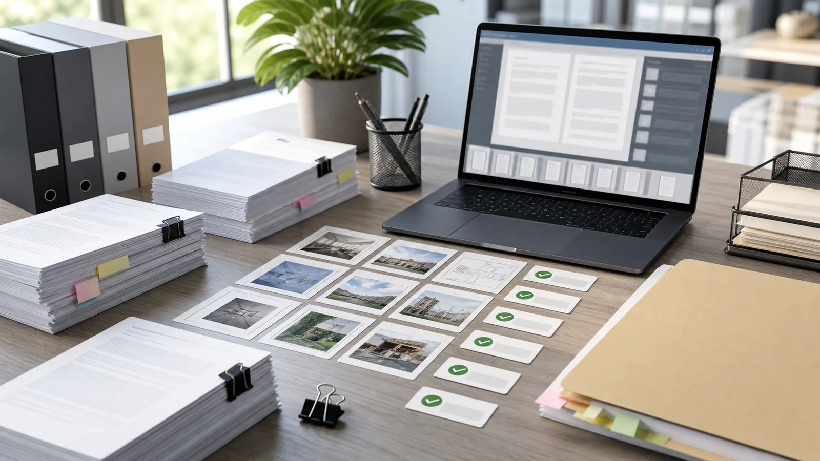
Print review often becomes slower than it needs to be because every asset is opened, zoomed, downloaded, forwarded, and commented on separately. A sticker set might arrive as twenty PNG files. A sales insert might have four front options and four back options. A packaging team might need to compare ten label variations before sending one to the printer. None of these tasks always justify opening InDesign, Illustrator, or a full prepress suite.
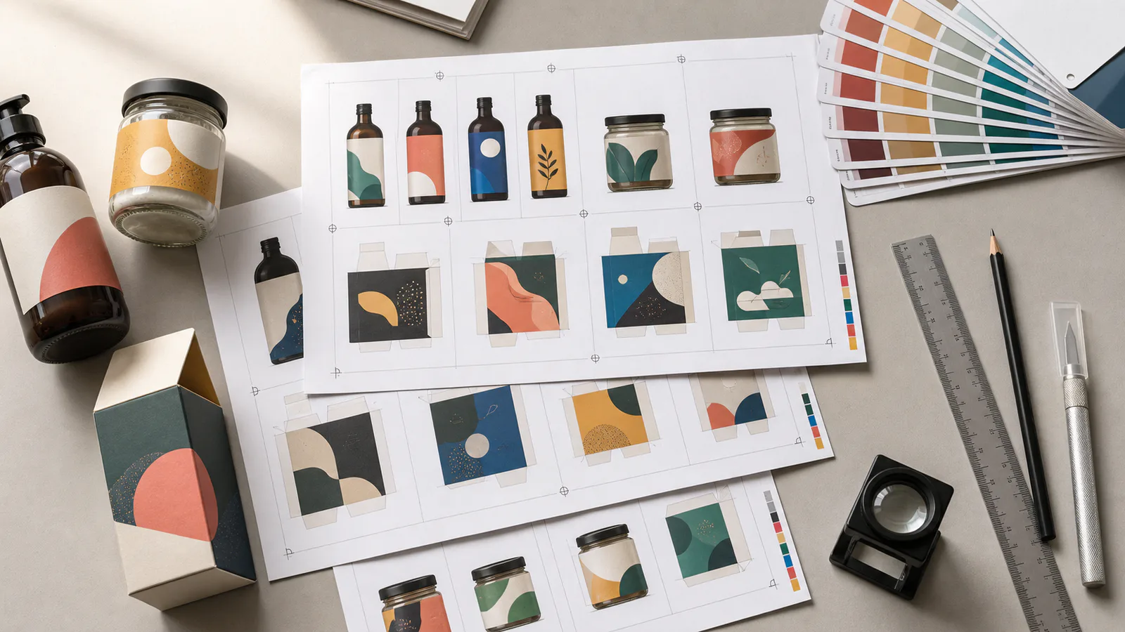
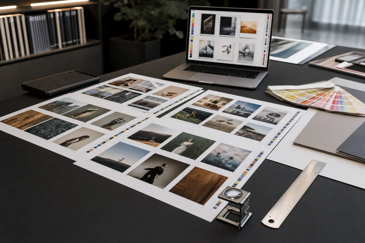
An N-up proof sheet solves a specific review problem: it places multiple items on one page so people can compare them together. Instead of reviewing one asset at a time, reviewers see scale, spacing, visual consistency, naming, and sequence in a single PDF. The sheet may not be the final production layout, but it gives a clean review surface.
This guide is for marketers, operations teams, small publishers, makers, ecommerce teams, and print coordinators who need practical proof sheets without becoming layout technicians. It focuses on decisions you can make before the file reaches a designer or print vendor: what to include, how to size assets, how to avoid blurry previews, and when to create a simple PDF rather than a production-ready imposition file.
What an N-Up Proof Sheet Means
N-up means several items are placed on one page. A 2-up sheet shows two items. A 4-up sheet shows four. A 12-up sheet might show twelve labels, cards, thumbnails, coupons, or small panels.
In professional print production, N-up can refer to exact imposition for cutting, folding, binding, or press efficiency. That kind of file may include bleeds, trim boxes, marks, gutters, and strict printer specifications. This article is about review proof sheets, which are simpler. A proof sheet helps humans inspect and approve assets before final production.
That distinction matters. A review proof sheet can answer questions such as:
- Are all versions present?
- Do the labels feel visually consistent as a set?
- Are product colors or image crops drifting between variants?
- Is the small type likely to remain legible?
- Did the team accidentally mix old and new assets?
- Are front and back sides paired correctly?
A proof sheet should reduce confusion. It should not pretend to replace a printer's final setup instructions when the job has strict finishing requirements.
What N-Up Proof Sheets Are Best For
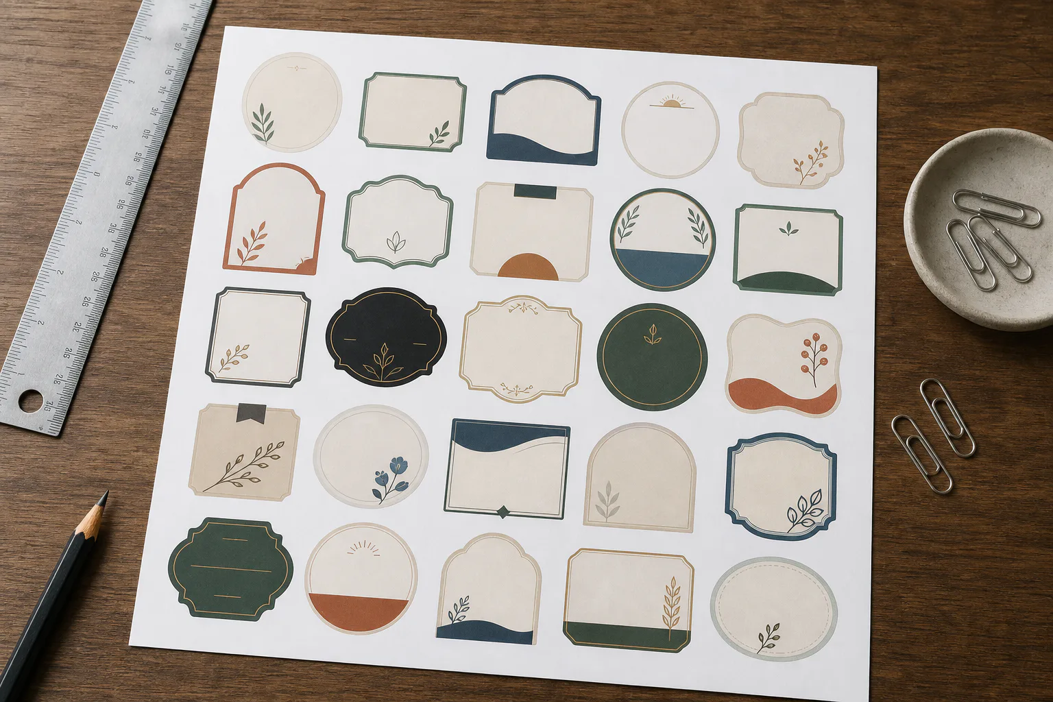
N-up sheets are useful when comparison is more important than individual presentation. They work especially well for small or medium-sized assets where reviewers need to see patterns across a set.
Common examples include:
- Product labels for jars, bottles, packets, or sample boxes
- Sticker sheets and promotional decal sets
- Event badges, place cards, or table cards
- Coupon, voucher, and gift card variations
- Package inserts and instruction cards
- Direct mail front and back concepts
- Small posters or shelf talkers reviewed in batches
- Social ad thumbnails prepared for print discussion
- QR instruction cards for field teams
- Local publication ads collected for approval
The key is not the industry. The key is repetition. If you have multiple related assets and reviewers keep asking to see them side by side, an N-up proof sheet is probably useful.
There are cases where it is less useful. A large poster with fine details may need its own full-size review PDF. A folded brochure needs spread and fold review, not only a grid. A regulated package label may require strict review at actual size. Use N-up sheets for comparison, then provide full-size files for final technical checks.
Pick the Right Review Goal First
Before building the sheet, decide what kind of review you want. Teams often combine too many goals into one PDF, which creates a sheet that is neither clean nor useful.
Use this table to choose the format:
| Review goal | Best sheet style | What to emphasize |
|---|---|---|
| Compare design options | Large 2-up or 4-up grid | Visual differences, hierarchy, color, spacing |
| Check a full set of labels | Dense 8-up, 12-up, or 20-up grid | Completeness, naming, consistency |
| Approve actual size | Fewer items per page | Scale, margins, small text, trim area |
| Review front and back pairs | Paired rows or columns | Correct matching, sequence, orientation |
| Catch image quality issues | Larger previews | Crop, sharpness, compression artifacts |
| Send lightweight email review | Compressed PDF with moderate previews | File size, readability, easy commenting |
If the team must approve tiny legal copy, do not squeeze twenty labels onto one page. If the team only needs to confirm that all seasonal color variants are present, a denser grid is fine. The best proof sheet is built around the decision reviewers need to make.
The Preflight Checklist Before You Build the Sheet

A clean N-up sheet starts before the PDF exists. If the source files are inconsistent, the sheet will expose that inconsistency. That can be good, but only if you know what you are looking at.
Use this checklist before assembling anything:
- Confirm the final asset list and remove old drafts.
- Use clear file names that include product, version, side, and date when needed.
- Separate fronts and backs if they need paired review.
- Check that all files use the intended format: PNG, JPG, WebP, or PDF.
- Make sure transparent assets have clean edges before placing them on white or colored paper.
- Resize oversized images so the proof PDF does not become unnecessarily heavy.
- Avoid heavy compression before small text has been checked.
- Keep originals in a separate folder so review copies do not replace source assets.
- Confirm whether reviewers need actual-size output or only visual comparison.
- Decide whether the sheet will be printed, reviewed on screen, or both.
For mixed image formats, normalize the files before assembly. If one label is a PNG, another is a huge JPG, and another is a WebP downloaded from a CMS, the proof sheet may show inconsistent color, transparency, or sharpness. Convert assets with a tool like Convert Image when a consistent format will make review easier.
If source images are very large, resize copies rather than forcing a proof PDF to carry oversized files. The Resize Image tool is useful when you need review-size copies while preserving the original production files elsewhere.
Actual Size Versus Comparison Size
One of the most important decisions is whether the assets must appear at actual printed size.
Actual-size proofing is useful for:
- Product labels with small ingredients or compliance text
- Business cards and appointment cards
- QR instruction cards
- Stickers where edge thickness matters
- Inserts that must fit inside packaging
- Badges or name cards that will be read at arm's length
Comparison-size proofing is useful for:
- Early creative options
- Colorway reviews
- Thumbnail review across many variants
- Checking that a set is complete
- Spotting inconsistent crops or background treatments
If you need actual size, print a test page at 100 percent scale. Do not use fit-to-page in the print dialog. Fit-to-page can shrink the sheet slightly, which makes small type and margins look safer than they really are. Add a simple ruler check in the margin if your layout tool allows it, or include one known-size item on the page.
If you only need comparison, you can scale items down. Just label the PDF or cover note clearly in your project system so nobody mistakes it for a production-size proof.
Choosing Page Size and Grid Density
Most teams default to letter or A4 pages because they are easy to print and share. That is usually fine for proof sheets. The bigger question is how many items should sit on each page.
A practical starting point:
| Asset type | Suggested density | Notes |
|---|---|---|
| Business cards | 8-up or 10-up | Good for front/back comparison if paired carefully |
| Small labels | 12-up to 24-up | Use fewer per page when tiny text matters |
| Package inserts | 2-up or 4-up | Leave room for comments and visual inspection |
| Sticker concepts | 12-up or more | Works well for shape and color comparison |
| Flyer options | 2-up | Keeps layout and hierarchy readable |
| Social ad thumbnails for print review | 6-up or 9-up | Useful when checking campaign consistency |
Grid density affects reviewer behavior. Dense sheets encourage completeness checks. Sparse sheets encourage careful reading. When in doubt, create two PDFs: one overview sheet and one detail sheet. The overview helps stakeholders choose directions. The detail sheet helps the person responsible for final quality catch problems.
Margins, Gutters, and Breathing Room
A proof sheet does not need to look fancy, but it does need enough spacing to prevent confusion. Reviewers should be able to tell where one asset ends and the next begins.
Use generous outer margins if the sheet will be printed. Home and office printers often cannot print to the exact edge of the paper. If the page is crowded, the top or bottom row may get clipped.
Use gutters between items. For rectangular assets, equal gutters make comparison easier. For irregular transparent stickers or logos, a subtle neutral background can reveal edges without overpowering the design. Avoid busy backgrounds. A proof sheet is not a mood board.
For paired items, keep the pairing obvious. Put front and back versions next to each other or stack them in a repeated pattern. Do not place all fronts on page one and all backs on page two unless the review goal is only to inspect each side independently. Pairing errors are easier to catch when related items stay close.
Handling Transparent PNG and WebP Assets
Transparent assets can look clean on screen but fail review when placed on white paper. White edges, semi-transparent halos, and jagged masks may disappear until the asset is printed on a colored surface.
For transparent product images, logos, stickers, and overlays, inspect them against at least two backgrounds before building the sheet: white and a mid-tone gray or neutral color. If the asset has a pale border, white paper may hide it. If it has dark fringing, gray may reveal it.
A few practical checks:
- Zoom in around curved edges and corners.
- Look for leftover background pixels from the original photo.
- Check shadows for abrupt cutoffs.
- Confirm that transparent holes are truly transparent.
- Avoid flattening transparent assets too early if the final use requires transparency.
If an asset needs cleanup before proofing, the AI Photo Editor can help with visual edits such as removing distracting background remnants or preparing cleaner product imagery for review copies. For format conversion, use Convert Image to prepare consistent PNG or WebP versions depending on what the team needs to inspect.
Image Quality: How Much Resolution Is Enough?
A proof sheet does not always need production-resolution images, but it does need enough detail for the review goal. The wrong resolution causes two different problems. Oversized files make the PDF heavy and slow. Undersized files make good assets look blurry, which leads to unnecessary revision cycles.
For on-screen comparison, moderate image sizes are usually enough. For printed proofing, use higher resolution, especially for small type and line art. Thin rules, icons, barcodes, QR codes, and small labels suffer quickly when compressed too far.
A simple rule: if the proof sheet is meant to catch print readability problems, do not rely on a heavily compressed preview. If the sheet is only meant to confirm that ten color variants exist, you can use lighter files.
Watch for these warning signs:
- Small text looks fuzzy even at 100 percent zoom.
- QR codes appear softened or smeared.
- Thin borders fade unevenly.
- Product photos show blocky compression around edges.
- Transparent artwork has crunchy outlines.
- Screenshots show blurred UI labels or icons.
When the proof PDF is too large to email, compress a copy after review quality has been checked. The Compress Image tool can reduce image assets before PDF assembly when the sources are larger than the review requires. Keep a higher-quality copy for final checks if small details matter.
Building a Simple Proof PDF Without Layout Software
You do not need a professional layout application for every proof sheet. For many review tasks, you can use a document editor, slide editor, image grid maker, or PDF utility. The important part is to keep the output predictable.
A simple method looks like this:
- Create a folder for review copies, separate from originals.
- Normalize formats if needed so all assets behave consistently.
- Resize oversized images to a practical review size.
- Arrange assets in a grid on letter or A4 pages.
- Keep front/back pairs together when relevant.
- Export to PDF.
- Open the PDF at 100 percent and inspect it before sending.
- Print one page if physical scale matters.
- Compress only after confirming readability.
- Send the proof PDF with clear approval instructions.
If you are starting from field photos, scans, or separate image files, a tool like Image to PDF can help package visual assets into a single PDF for review. For multi-part review packets, use PDF Merge to combine a cover page, overview sheet, detail pages, and supporting files into one clean document.
The goal is not to create a beautiful design artifact. The goal is to create a review document that prevents missed assets, wrong versions, and unclear comments.
Naming Pages and Files So Reviewers Do Not Guess
N-up proof sheets often fail because the PDF itself is visually fine but the surrounding file names are vague. A file called proof-final-new2.pdf is an invitation to confusion.
Use names that explain what the reviewer is seeing:
| Weak name | Better name |
|---|---|
labels.pdf | spring-candle-labels-review-12up-2026-05-21.pdf |
card-options-final.pdf | membership-card-front-options-4up-round2.pdf |
stickers-new.pdf | event-sticker-set-overview-20up-client-review.pdf |
insert-proof.pdf | box-insert-front-back-pairs-actual-size-proof.pdf |
When possible, include the sheet purpose in the name: overview, actual-size, paired, detail, or review copy. A clear file name reduces the need for explanation in email threads and project comments.
Inside the PDF, visual labels can be useful, but avoid crowding the sheet. If labels are necessary, keep them outside the artwork area. The label should identify the asset, not become part of the asset.
Commenting Strategy for Faster Approval
A proof sheet is only helpful if comments land in the right place. Dense grids can produce vague feedback like “make the blue one brighter” or “I prefer the third label.” That is risky when there are multiple pages or similar variants.
Set a simple commenting convention before review begins:
- Refer to page number and row or column.
- Use asset names when they are visible.
- Quote the exact change when editing copy.
- Mark whether the comment is required or optional.
- Avoid combining approval and new creative requests in one note.
For example, “Page 2, row 3, column 2: approve layout, but replace product photo with the updated jar image” is much clearer than “use the newer image.”
If reviewers will print the sheet and mark it by hand, leave extra margin for notes. If they will comment digitally, avoid placing items too close to the page edge where annotation tools can become awkward.
Common Mistakes That Make Proof Sheets Hard to Trust
N-up sheets look simple, which is why mistakes slip in. Most problems come from mixing review goals, using inconsistent sources, or compressing too early.
Avoid these common issues:
- Placing actual-size and scaled-down assets on the same page without saying so.
- Mixing old and new versions in the same folder.
- Exporting low-resolution screenshots of designs instead of the real image or PDF files.
- Compressing QR codes, barcodes, and tiny type until they are no longer reliable.
- Forgetting to include backs, alternate languages, or regional variants.
- Pairing the wrong front and back items.
- Cropping off bleed or safe-area context when reviewers need to check edges.
- Sending a proof sheet without the source asset list.
- Using a decorative background that hides transparency problems.
- Assuming a review PDF is automatically suitable for final print production.
The last point is especially important. A proof sheet can support approval, but final production files should still follow printer requirements. If the printer asks for bleed, trim, CMYK settings, embedded fonts, or a specific PDF standard, handle that separately.
A Practical Setup for Label and Sticker Reviews
Label and sticker sets are one of the best uses for N-up proof sheets because they involve repeated assets with small differences. A candle maker, supplement brand, event organizer, or local retailer may need to compare many similar pieces quickly.
For labels, create at least two review views:
| Sheet | Purpose | Suggested layout |
|---|---|---|
| Overview sheet | Confirm the full set and compare style | 12-up to 24-up grid |
| Detail sheet | Inspect small text and edges | 4-up to 8-up grid |
| Actual-size sheet | Check physical scale | As many as fit without scaling |
For stickers, add a background check if the artwork has transparency. Place one version on white and one on a neutral mid-tone background if possible. This helps reveal edge artifacts that would otherwise remain hidden.
If the sticker set has irregular shapes, do not crop each asset too tightly. Leave enough transparent area or boundary context so reviewers can understand the intended shape and spacing. If the sticker will be kiss-cut, ask the production partner whether a cut line or separate technical file is needed. The proof sheet can show the art, but the cutting path may be a separate production concern.
A Practical Setup for Cards, Inserts, and Small Print Pieces
Cards and inserts need a different approach because front/back pairing often matters more than grid density. A dense overview may help, but the approval decision usually depends on reading hierarchy, checking sequence, and confirming that the back side belongs with the correct front.
For cards, use paired rows:
| Row pattern | Best for |
|---|---|
| Front left, back right | Business cards, appointment cards, loyalty cards |
| Front above, back below | Tall cards or narrow inserts |
| Option A pair, Option B pair | Comparing design directions |
| One pair per page | Final approval at readable size |
For inserts, include enough surrounding space to judge margins. Inserts often fail because content feels acceptable on screen but cramped when printed and trimmed. If the piece goes inside packaging, print a physical sample and place it in the package before approval.
When small print pieces include QR codes, test them from the printed proof. A code that scans from a high-resolution screen may not scan reliably after print, trimming, lamination, or folding.
When to Merge Supporting Pages Into the Same PDF
Sometimes the proof sheet alone is not enough. Reviewers may need context: a cover note, a source list, full-size details, or reference photos. In that case, combine the supporting pages into one PDF instead of scattering attachments.
A clean review packet might include:
- Cover page with project name and review date.
- Overview N-up sheet.
- Actual-size detail sheet.
- Front/back paired sheet.
- Reference photos or placement mockups.
- Final decision page or signoff page if your team uses one.
Use PDF Merge when you need to combine these pieces after exporting them from different tools. Keeping everything in one PDF helps reviewers comment in context and reduces the chance that someone approves one attachment while missing another.
Final Quality Pass Before Sending
Before sending the proof sheet, open the exact PDF reviewers will receive. Do not inspect only the source document. Export settings, compression, and page scaling can change the result.
Run this final pass:
- Open the PDF at 100 percent zoom.
- Check the first and last page for missing items.
- Confirm that the page order matches the review request.
- Inspect small text, QR codes, thin lines, and image edges.
- Print one page if physical scale matters.
- Check that file size is reasonable for the delivery channel.
- Confirm that the file name includes project, purpose, and date or round.
- Make sure reviewers know whether they are approving concept, content, scale, or final production direction.
If the PDF is too large after the quality pass, compress a review copy and inspect it again. Never assume compression is harmless. It is often fine for photo-heavy overview sheets, but risky for tiny type, codes, and line art.
A Better Review Habit for Small Teams
N-up proof sheets are not glamorous, but they solve a real coordination problem. They turn scattered assets into one review surface, make missing versions easier to spot, and reduce vague comments. For small teams without dedicated prepress support, that can prevent expensive mistakes before files move further downstream.
The best proof sheets are built with restraint. Choose one review goal. Use consistent source files. Keep the grid readable. Preserve enough quality for the decision at hand. Name the PDF clearly. Then send one clean review packet instead of a pile of disconnected attachments.
When a job becomes technically strict, bring in the printer's specifications and production files. But for everyday comparison, approval, and version checks, a well-built N-up proof sheet is often the fastest way to get everyone looking at the same thing.