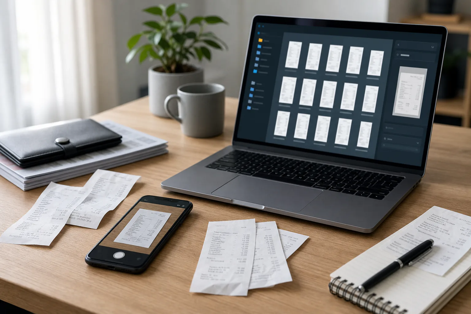
Screenshot Sprite Sheets for QA Handoff: A Practical Workflow for Reviewing Many UI States
Learn how to turn scattered UI screenshots into compact sprite sheets and review PDFs for QA, design checks, localization, and release sign-off.

Screenshot Sprite Sheets for QA Handoff: A Practical Workflow for Reviewing Many UI States
A single screenshot is easy to discuss. Fifty screenshots are not. By the time a product team has captured empty states, loading states, error messages, permission dialogs, responsive breakpoints, dark mode, localization variants, and post-release fixes, the review folder often becomes a small maze. People open images one by one, lose track of what changed, and leave comments that depend on file names nobody remembers.
A screenshot sprite sheet solves a specific version of that problem. Instead of treating each capture as a separate artifact, you combine related screenshots into one compact visual grid. The result is not a design system, not a prototype, and not a replacement for QA test cases. It is a review surface: one image or PDF page where a reviewer can scan many UI states at once and notice inconsistencies faster.
This workflow is especially useful for small product teams that do not have a dedicated release operations process. It works for SaaS dashboards, mobile onboarding flows, help center screenshots, settings pages, checkout states, admin tools, and internal portals. The goal is simple: make visual review boring, repeatable, and easy to archive.
When a Sprite Sheet Beats a Folder of Screenshots
A folder is fine when screenshots are independent. A sprite sheet is better when screenshots belong to the same decision.
If you are reviewing whether a button style is consistent across ten modal states, opening ten files separately creates friction. If you are checking whether translated labels still fit in a mobile layout, side-by-side comparison matters. If you are asking a stakeholder to approve a release candidate, a compact grid is easier to mark up than a scattered folder.
Use a screenshot sprite sheet when the reviewer needs to compare, not just inspect. The format makes patterns visible: uneven padding, inconsistent empty-state illustration sizes, mismatched heading levels, cropped text, modal shadows, weak contrast, or a loading skeleton that no longer matches the final layout.
It also gives the team a durable artifact. A single sprite sheet can be attached to a ticket, added to a release note draft, stored in a QA archive, or converted into a review PDF. Months later, it is much easier to answer "what did we approve before launch?" when the evidence is one named asset instead of a pile of images.
Pick a Narrow Review Scenario
The best sprite sheets are intentionally narrow. If you try to include every screenshot from a release, the sheet becomes a collage nobody wants to inspect. Start by defining the review question.
Good review scenarios include:
- Are all account settings states visually consistent after the redesign?
- Do localized onboarding screens still fit at mobile width?
- Did the billing error states survive the new form component?
- Are help center screenshots using the latest navigation and product chrome?
- Do dark mode states match the same spacing and hierarchy as light mode?
Weak review scenarios are too broad:
- Check the whole app.
- Review all screenshots.
- Approve the release.
- Look for anything weird.
A sprite sheet should answer one focused question. If you have several questions, make several sheets. A design lead reviewing visual consistency needs a different asset than a QA engineer checking error coverage or a localization manager checking text expansion.
Decide What Belongs in the Grid
Before editing anything, create a capture list. This prevents the sprite sheet from becoming a random dump of whatever someone happened to screenshot first.
A practical capture list has four columns: screen, state, viewport, and note. You can keep it in a ticket, spreadsheet, or plain text document.
| Screen | State | Viewport | Note |
|---|---|---|---|
| Sign in | Empty form | Mobile | Baseline |
| Sign in | Validation errors | Mobile | Long error copy |
| Sign in | Loading | Mobile | Button spinner |
| Password reset | Success | Mobile | Confirmation copy |
| Billing settings | Card expired | Desktop | Alert placement |
For a compact review, aim for 12 to 30 screenshots per sprite sheet. Fewer than 12 may not need a sheet. More than 30 can still work, but only if the captures are very uniform and the review is about spotting patterns rather than reading details.
If the screenshots are mixed sizes, decide whether the grid will preserve original proportions or normalize them. Product review usually benefits from normalized dimensions because spacing and alignment problems become easier to compare. Documentation review may benefit from preserving full screenshot shapes because the final publishing context matters.
Capture Screenshots Consistently
A sprite sheet is only as useful as the screenshots inside it. If every capture has a different browser zoom, viewport size, crop boundary, and theme, reviewers will spend their attention separating real UI problems from capture noise.
Use a consistent capture routine:
- Set browser zoom to 100 percent.
- Use fixed viewport sizes for each device class.
- Capture the same UI boundary each time.
- Hide unrelated browser chrome unless it is part of the review.
- Use stable test data where possible.
- Avoid animated moments unless animation state is the subject of review.
For web apps, common review widths are 390 px for mobile, 768 px for tablet, and 1440 px for desktop. You do not need all three unless the review is about responsiveness. If the question is mobile localization, keep the sheet mobile-only. If the question is a desktop dashboard redesign, keep the sheet desktop-only.
Also decide how to handle scroll. Full-page screenshots are useful for page-level review, but they can make grid cells very tall. For state comparison, viewport screenshots are usually more readable. If a long page has several important regions, capture the regions separately and name them clearly.
Clean the Screenshots Before Assembly
Do not build the sheet first and clean later. Once screenshots are combined, it becomes harder to fix one bad crop or one oversized image without rebuilding the whole asset.
Start with basic hygiene. Crop away accidental desktop edges, unrelated browser UI, debugging overlays, and blank margins. Resize screenshots to consistent dimensions when comparison is the goal. Convert odd formats into a predictable format before layout. If some screenshots are huge, reduce them before arranging the grid so the final sheet stays manageable.
ConvertAndEdit tools can handle the common preparation steps in a browser-based workflow. Use Resize Image when captures need consistent dimensions. Use Convert Image when screenshots arrive as a mix of PNG, JPEG, or WebP and you want a clean working format. Use Compress Image near the end to reduce the final sheet without making UI text fuzzy.
For UI screenshots, be careful with aggressive compression. Thin text, hairline borders, icons, and focus rings can blur quickly. If the sheet is for visual QA, readability is more important than the smallest possible file. A slightly larger PNG or high-quality WebP is often better than a tiny JPEG with artifacts around every label.
File Naming That Makes Review Possible
File names are not glamorous, but they carry the review. A sprite sheet without a reliable file order can accidentally hide missing states or place related states far apart.
Use names that sort naturally:
| Pattern | Example | Best for |
|---|---|---|
| Numbered flow | 01-sign-in-empty.png | Sequential user journeys |
| Screen-state | billing-card-expired.png | Feature-specific reviews |
| Viewport-state | mobile-password-reset-success.png | Responsive checks |
| Locale-screen-state | de-onboarding-step-02.png | Localization reviews |
Avoid vague names like screenshot-final.png, new-error.png, desktop-2.png, or image-copy.png. They might make sense during capture, but they break down during review.
If you are assembling the grid manually, file names help you place screenshots in the right order. If you are using a design tool, file names can become layer names. If you later convert the sprite sheet into a PDF review packet, the same naming pattern helps connect comments back to the original screenshot.
Build the Sprite Sheet Layout
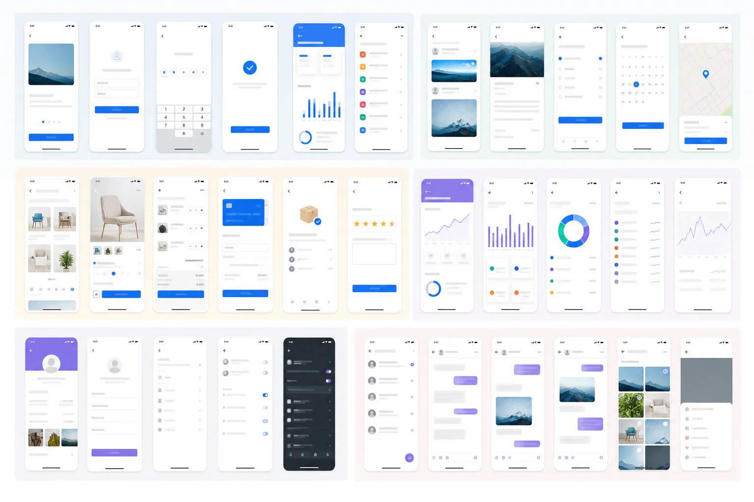
The layout should make comparison easy. Do not overdesign it. A sprite sheet is a working artifact, so the best layout is usually a plain grid with consistent gutters and enough whitespace to separate states.
A good default setup:
| Use case | Columns | Cell treatment | Output |
|---|---|---|---|
| Mobile flow review | 4 to 6 | Same width, natural height | PNG or PDF |
| Desktop state review | 2 to 3 | Same width, scaled down | |
| Localization check | 3 to 5 | Same viewport, grouped by locale | PNG |
| Error state audit | 4 | Same component boundary | PNG |
| Stakeholder sign-off | 2 to 4 | Larger cells, more whitespace |
Keep the gutters large enough that screenshots do not visually merge. For most sheets, 24 to 40 px between cells works well. If your screenshots have white backgrounds, use a very light neutral canvas behind them so cell edges remain visible. If your product uses dark mode, use a neutral mid-gray canvas rather than pure black; it keeps shadows and edges easier to see.
The biggest layout decision is whether to add labels. Labels can help, but they also introduce text that may conflict with the UI text inside the screenshots. If you add labels, keep them outside the screenshot cells, short, and consistent. For example: 01 Empty, 02 Error, 03 Loading. If the sheet is going into a ticket where file names are already listed, you may not need visible labels at all.
Group Screenshots by the Question Being Asked
A random grid is better than a folder, but a grouped grid is much better. The arrangement should reflect the review logic.
For a user journey, place screens from left to right in sequence. For responsive review, put mobile, tablet, and desktop versions in the same row. For localization, put the same screen state next to each language. For component states, group by default, hover, focus, disabled, loading, success, and error.
Here are practical grouping patterns:
| Review question | Recommended grouping |
|---|---|
| Does the flow still make sense? | Sequence by user journey |
| Did responsive layouts survive? | Rows by screen, columns by viewport |
| Does translated text fit? | Rows by state, columns by locale |
| Are component states consistent? | Rows by component, columns by state |
| Did a redesign affect old screens? | Before and after pairs |
Grouping reduces reviewer fatigue. Instead of asking someone to remember that screenshot 18 should be compared with screenshot 3, the sheet puts the comparison in front of them.
Use OCR for Text-Heavy Screenshot Checks
Sprite sheets are visual, but many UI defects are text defects: truncated labels, old feature names, inconsistent capitalization, missing legal copy, or untranslated strings. If the sheet includes many text-heavy screens, add an OCR pass before sign-off.
You can use Image OCR on individual screenshots before assembly, or on a readable sprite sheet if the text remains large enough. Individual screenshots are usually more reliable because OCR has more pixels per line of text. The extracted text can then be compared against approved copy, localization files, or release notes.
OCR is especially useful for:
- Settings pages with many labels.
- Checkout or billing flows with compliance copy.
- Onboarding screens translated into multiple languages.
- Help center screenshots that must match current UI terms.
- Error states where exact wording matters.
Do not treat OCR as a perfect proof. It is a quick way to surface suspicious text. Human review still matters, especially for small UI labels, icons with embedded letters, screenshots with blur, and languages with longer compound words.
Annotate Only What Needs Action
A sprite sheet can become noisy if every reviewer adds arrows, circles, and notes directly on top of the grid. Use annotation sparingly. The sheet should remain scannable after comments are added.
A useful annotation system has three levels:
| Mark | Meaning | Action |
|---|---|---|
| Small numbered marker | Needs discussion | Add comment in ticket |
| Highlight box | Visual issue | Assign fix owner |
| Check mark outside cell | Approved state | No action |
Keep annotations outside the most important UI details when possible. If you must mark inside a screenshot, place the marker near the issue rather than covering it. For sensitive screenshots, redact before annotation, not after. Redaction should be part of the source screenshot cleanup stage so private data never ends up in the combined sheet.
If you need to improve a screenshot visually for documentation rather than QA evidence, AI Photo Editor can help with image cleanup tasks. For QA sign-off, however, avoid edits that alter the actual UI. The review asset should represent the product state honestly.
Create a Review Packet for Sign-Off
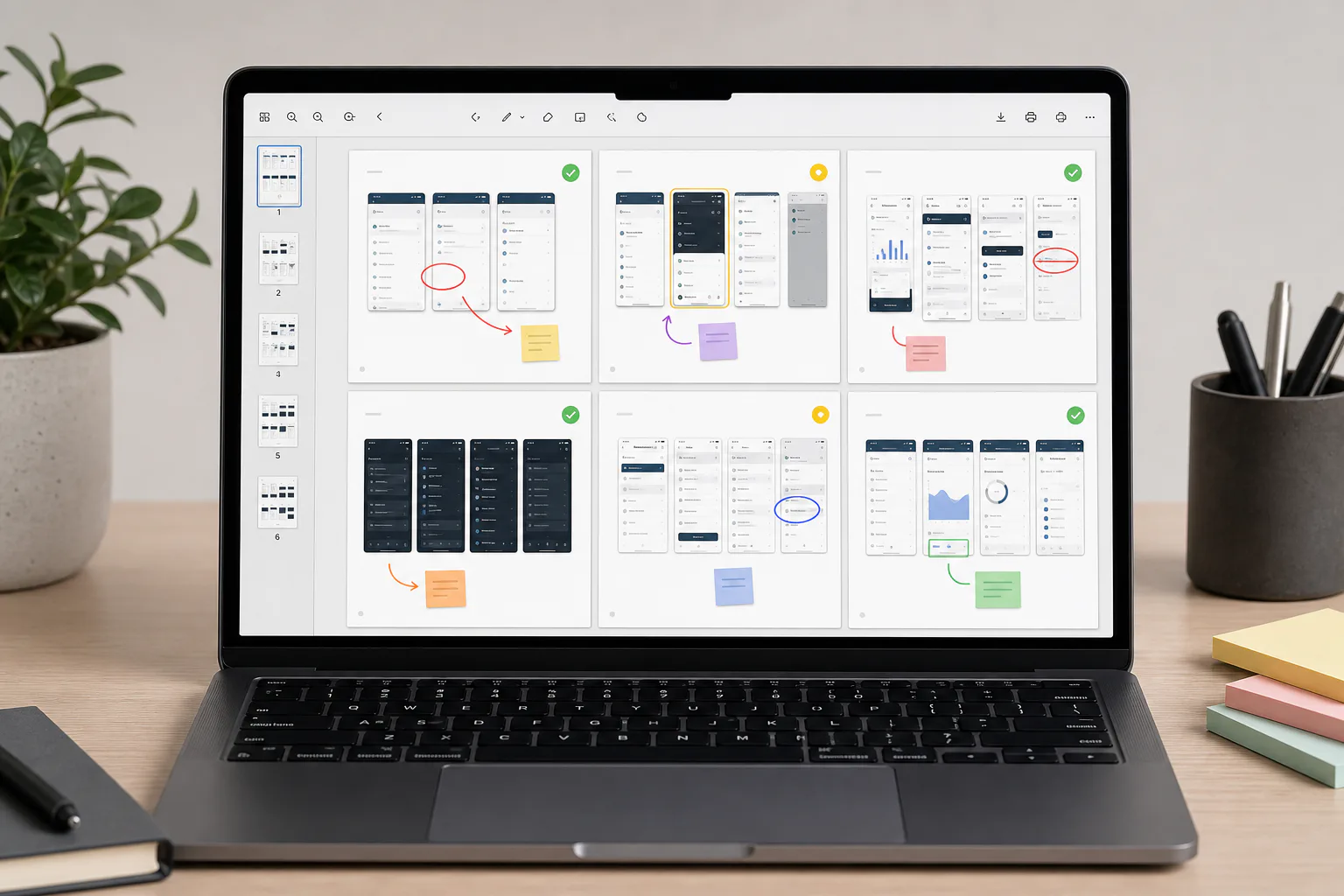
A single image works well in chat or a ticket, but PDF is better for formal review. A PDF packet can include multiple sprite sheets: mobile states, desktop states, localization variants, and a final approval page. It is easier to archive and easier for external partners to mark up.
Use Image to PDF when you want to package the finished sprite sheets into a shareable review document. Keep each sheet on its own page if the images are dense. If the review includes both full-page screenshots and compact grids, put the compact grids first so the reviewer sees the overview before the details.
A practical packet structure:
| Page | Content | Purpose |
|---|---|---|
| 1 | Overview sprite sheet | Fast scan of all states |
| 2 | Mobile states | Detailed mobile review |
| 3 | Desktop states | Detailed desktop review |
| 4 | Text-heavy states | Copy and localization review |
| 5 | Approved final sheet | Archive artifact |
Avoid turning the packet into a report unless the team actually needs one. The asset should help people make decisions quickly. If a decision requires long written explanation, keep that in the ticket or release document and let the PDF remain visual evidence.
Compression Without Losing UI Detail
After assembly, check the final file size. Sprite sheets can become large because they combine many high-resolution images. But UI screenshots punish bad compression. Text edges, icons, and 1 px borders expose artifacts immediately.
Use compression in stages. First, resize the sheet to the largest size reviewers need. There is no point compressing a 9000 px wide image if nobody can view it comfortably. Then compress a copy and compare it at 100 percent zoom. If labels blur or borders shimmer, back off.
A good review asset should be readable at normal viewing size. If the reviewer must zoom to 300 percent to read button labels, the grid is too dense or the compression is too strong. Split the sheet into multiple pages instead of forcing everything into one tiny image.
For most UI review sheets:
| Output | Recommended use | Watch out for |
|---|---|---|
| PNG | Sharp internal review | Larger file size |
| WebP | Good balance for sharing | Check thin text carefully |
| JPEG | Photo-heavy screenshots | Artifacts around UI text |
| Sign-off and archive | Page scaling can reduce readability |
If the sheet will be embedded in a documentation page or release note, use Compress Image after confirming that the visual details still hold up. For internal QA archives, prioritize fidelity over file size.
A Complete Workflow Example
Imagine a small SaaS team preparing a billing settings release. The change touches payment method states, invoice history, failed payment alerts, empty invoice lists, and a new confirmation dialog. The team needs design review, QA approval, and a record for the release ticket.
The workflow could look like this:
- Define the review scope: billing settings visual QA for mobile and desktop.
- Create a capture list with each screen state and viewport.
- Capture screenshots at 390 px mobile and 1440 px desktop.
- Rename files using numbers and state names.
- Crop accidental browser chrome and normalize dimensions.
- Build one mobile sprite sheet and one desktop sprite sheet.
- Group rows by screen and columns by state.
- Run OCR on text-heavy states such as failed payment alerts.
- Add only numbered markers for issues that require action.
- Export final sheets and combine them into a PDF packet.
- Attach the packet to the release ticket.
- After fixes, create a final approved version and archive it.
This is not complicated, but it removes ambiguity. Everyone reviews the same artifact. Comments refer to visible positions in the same grid. The release record has a clear before-approval and after-fix trail.
QA Checklist Before Sharing
Before sending the sprite sheet to reviewers, run a quick quality check. This takes a few minutes and prevents predictable confusion.
| Check | Why it matters |
|---|---|
| All expected states are present | Prevents silent coverage gaps |
| Screenshot dimensions are consistent | Makes visual comparison fair |
| File names match grid order | Helps comments map back to sources |
| Text is readable at 100 percent zoom | Avoids useless review passes |
| Sensitive data is removed | Prevents accidental exposure |
| Compression artifacts are acceptable | Protects fine UI detail |
| Grouping matches the review question | Reduces reviewer fatigue |
| Final PDF or image opens correctly | Avoids broken handoff moments |
If the sprite sheet fails more than two of these checks, fix the source images and rebuild it. Patching the combined asset usually creates more problems than it solves.
Common Mistakes to Avoid
The most common mistake is making the sheet too large in scope. A giant wall of screenshots looks productive, but reviewers stop seeing details. Split by feature, viewport, or decision type.
The second mistake is mixing evidence with polished marketing edits. A QA sprite sheet should show what the product actually rendered. Cropping, resizing, format conversion, and compression are normal. Retouching UI defects out of the image is not appropriate for sign-off.
The third mistake is compressing too early. If source screenshots are heavily compressed before assembly, artifacts multiply when the final sheet is exported again. Keep clean working files until the final output step.
The fourth mistake is ignoring order. A grid should tell a reviewer what to compare. If related states are scattered across the canvas, the reviewer has to reconstruct the logic manually.
The fifth mistake is relying on the sheet as the only QA artifact. A sprite sheet is excellent for visual review, but it does not replace functional tests, accessibility checks, browser testing, or real user flows.
Where This Fits in a Release Workflow
Screenshot sprite sheets work best as a bridge between design review and release evidence. They are lightweight enough for weekly work, but structured enough to survive in an archive.
A small team might use them at three points:
| Moment | Sprite sheet role |
|---|---|
| Before implementation | Compare proposed UI states from design exports |
| During QA | Check implemented states across viewports and scenarios |
| Before release | Capture final approved visual evidence |
The format also helps cross-functional teams. Designers can review spacing and hierarchy. QA can verify state coverage. Product managers can approve visible behavior. Support teams can prepare updated help center screenshots. Localization reviewers can spot copy overflow.
Because the artifact is just an image or PDF, it travels well. It does not require everyone to have access to the same design tool, test environment, or project management system. That simplicity is the point.
Final Handoff Format
For most teams, the final handoff should include three things: the source screenshot folder, the sprite sheet image, and the review PDF if formal sign-off is needed. Name them consistently so the archive makes sense later.
Example folder:
billing-settings-qa-2026-05-14/
  sources/
    01-mobile-card-empty.png
    02-mobile-card-expired.png
    03-mobile-invoice-empty.png
  billing-settings-mobile-sprite.png
  billing-settings-desktop-sprite.png
  billing-settings-review-packet.pdf
This structure keeps the final assets easy to share while preserving the source captures for future fixes. If someone finds a problem later, they can return to the original screenshot instead of trying to crop it out of the combined grid.
A good screenshot sprite sheet does not make QA more elaborate. It makes the visual part of QA easier to see. When many UI states need the same decision, put them in the same place, keep the grid honest, and package the result so the team can review it without hunting through files.