Speaker Headshot Preflight for Conference Programs: Crop, Compress, and Package Consistent Portraits
A practical guide for preparing speaker headshots for conference websites, agendas, sponsor decks, printed programs, and last-minute media kits.
Speaker Headshot Preflight for Conference Programs: Crop, Compress, and Package Consistent Portraits
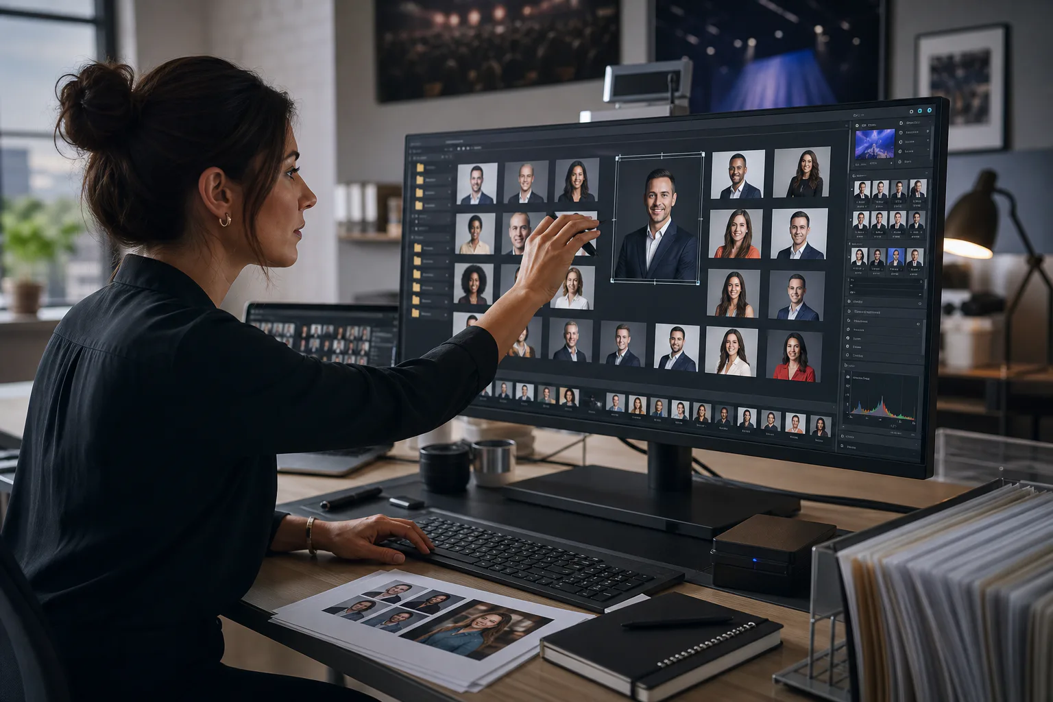
Speaker headshots look simple until an event team has to publish fifty of them across a conference website, agenda app, printed program, sponsor deck, press kit, and social announcements. One speaker sends a studio portrait. Another sends a square LinkedIn export. A keynote speaker sends a 12 MB portrait with a dramatic crop. A panel moderator sends a selfie from a hotel lobby. The job is not just to make these files smaller. The job is to make the whole speaker lineup feel intentional.
This guide is for event marketers, conference organizers, association teams, and small production teams that need a repeatable way to clean up speaker portraits without turning the task into a design project. The goal is a practical asset set: consistent crops, predictable filenames, fast web images, usable print files, and a simple review packet for stakeholders.
ConvertAndEdit tools can help with the repetitive parts. You can standardize dimensions with the resize image tool, reduce page weight with the compress image tool, normalize formats with the image converter, make light portrait fixes in the AI photo editor, and package review sheets with image to PDF. The important part is deciding the standard before you start editing.
Why Speaker Headshots Need Their Own Preflight
Conference portraits are not product photos, staff badges, or press portraits. They have a public-facing role, but they also have to survive many placements with different constraints. A website card may need a tight square crop. A printed agenda may need a portrait rectangle. A sponsor deck may place headshots beside long job titles. A mobile app may reduce everything to a tiny circle.
If you edit each image only for the first place it appears, problems show up later. Faces may be cropped too close for circular thumbnails. Backgrounds may clash across a speaker grid. File sizes may slow down the agenda page. Print exports may look soft because the only saved copy was a compressed web image.
A good preflight gives every portrait the same baseline treatment. It does not make every person look identical. It makes the asset set coherent enough that the event brand feels organized.
Decide The Output Set First
Before touching the images, list the final uses. Most conference teams need three to five versions of each portrait, not one universal file.
| Use | Recommended shape | Typical size | Format | Notes |
|---|---|---|---|---|
| Speaker grid on website | Square | 800 x 800 px | WebP or JPEG | Good balance for responsive layouts |
| Agenda detail page | Portrait rectangle | 900 x 1200 px | WebP or JPEG | More breathing room around shoulders |
| Social announcement | Square or 4:5 | 1080 x 1080 px or 1080 x 1350 px | PNG or JPEG | Keep source flexible for templates |
| Printed program | Portrait rectangle | At least 1500 px tall | JPEG or PNG | Save a higher-quality version |
| Press contact sheet | Mixed thumbnails | Useful for approval and sharing |
Do not start by compressing everything. First create a master edited version, then export smaller versions from that master. Compression should be close to the end of the process, after crop, format, and naming decisions are clear.
Build A Simple Headshot Standard Before Editing
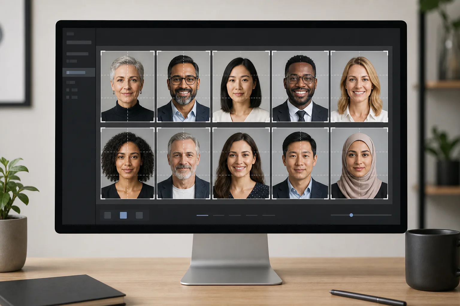
A headshot standard is a small set of rules that prevents guesswork. It should be short enough that a temporary assistant or freelancer can follow it. For most conference sites, these rules are enough:
- Face visible and centered, with eyes in the upper third of the frame.
- Head and shoulders included when the original allows it.
- Background left as supplied unless it is distracting or visibly low quality.
- No heavy beauty retouching, reshaping, or style changes.
- Square web crop saved for speaker cards.
- Taller portrait crop saved for agenda pages, print, and press.
- File names use one consistent pattern.
The eyes-in-upper-third rule matters because it gives portraits a consistent rhythm in a grid. If one face is low in the frame and another is cropped tight at the forehead, the page feels messy even when each individual photo is technically acceptable.
A practical square crop usually leaves a small margin above the hair and includes the upper shoulders. For circular avatars, leave extra space around the face because the corners will disappear. For portrait rectangles, keep more of the torso when possible, especially for keynote pages and printed programs.
Sort Incoming Files Into Quality Tiers
Not every supplied headshot deserves the same amount of attention. Sorting first saves time and keeps the team from over-editing images that are already fine.
| Tier | What it looks like | Action |
|---|---|---|
| Ready | Sharp, well-lit, large enough, professional crop | Resize and export |
| Usable | Slightly uneven crop, large file, mild color cast | Crop, resize, compress |
| Needs cleanup | Distracting background, dim lighting, awkward framing | Use light AI cleanup or request replacement |
| Risky | Very small, blurry, heavily filtered, screenshot of a profile photo | Request a better file if possible |
A common mistake is treating a tiny LinkedIn thumbnail as if it can become a full-quality press portrait. It cannot. Upscaling may make it larger, but it will not restore real detail. If the file is too small for print, label it for web only and ask the speaker for a higher-resolution image.
As a rule of thumb, a file under 500 px wide is usually too weak for anything beyond a small web thumbnail. A file around 1000 px wide can often work for web cards and agenda pages. For print, look for larger originals, ideally 1500 px tall or more after cropping.
Clean Up Only What Helps The Asset Set
Speaker portraits involve trust. The safest edits are technical corrections: crop, exposure, color balance, background distractions, and file preparation. Avoid edits that change identity, age, facial structure, hairline, skin texture in a dramatic way, or clothing details.
Use the AI photo editor for restrained fixes such as softening a distracting background, removing a stray object near the edge, or evening out lighting. Keep edits believable. The finished headshot should still look like the file the speaker approved or submitted.
Good cleanup requests are specific and limited. For example, ask for a less distracting background, a cleaner edge around the shoulder, or more balanced lighting. Poor requests are vague, such as make this look better, because they can produce inconsistent results across a speaker lineup.
If a portrait needs major reconstruction, do not quietly fix it. Ask for a replacement. This is especially important for executives, academics, medical speakers, legal experts, and public figures whose headshots may already have approved versions.
Crop For Faces, Not Just Canvas Size
Cropping is where most headshot sets succeed or fail. The canvas may be identical across all files, but the face scale can still vary wildly. A consistent speaker grid depends on visual scale, not just pixel dimensions.
When creating the square version, compare portraits side by side. The distance from chin to top of hair should feel similar across the set. People with tall hairstyles, hats, or distinctive clothing may need slight exceptions, but avoid extreme differences.
For portrait rectangles, preserve more context. The rectangle is usually better for bio pages, press kits, and printed programs because it gives the image a formal portrait feel. It also gives designers more flexibility when a layout includes titles, company names, or session details.
Use the resize image tool after the crop is chosen. Cropping and resizing are related, but they are not the same task. Crop decides composition. Resize decides output dimensions. If you resize first, you may lock yourself into a weaker crop.
Practical Crop Checks
Before exporting the set, scan for these issues:
- Hair, glasses, or shoulders cut off by accident.
- Faces that appear much larger or smaller than neighboring speakers.
- One portrait with a very dark background in an otherwise bright grid.
- Circular avatar previews that cut into the chin or forehead.
- Important clothing details removed from keynote or VIP portraits.
- Profile-photo screenshots with visible interface remnants.
A quick visual pass catches problems that automated resizing will not.
Choose Formats By Placement
There is no single best image format for every headshot placement. The best choice depends on page speed, transparency needs, print needs, and compatibility.
For most web speaker grids, WebP is a strong default because it keeps quality high at smaller file sizes. JPEG is still useful when compatibility with older systems or email tools matters. PNG is usually unnecessary for standard portraits unless a specific design requires transparency or the image includes sharp graphic elements.
Use the image converter when files arrive in mixed formats such as HEIC, TIFF, PNG, and large JPEGs. Normalizing the source set before export makes review easier. If speakers submit HEIC files from phones, convert them before passing assets to a CMS or design tool that may not handle HEIC reliably.
A sensible export set might look like this:
| Version | Format | Quality goal |
|---|---|---|
| Web square | WebP | Small, sharp, fast |
| CMS fallback | JPEG | Broad compatibility |
| Social template source | PNG or JPEG | Clean input for design templates |
| Print portrait | JPEG at high quality | Preserve detail |
| Review contact sheet | Easy approval |
Keep the original submissions in an untouched folder. If a crop decision changes later, you want to return to the best available source, not a compressed derivative.
Compress Without Making Faces Look Waxy
Compression can quietly damage portraits. Over-compressed skin loses texture. Hair becomes blocky. Glasses and teeth can develop artifacts. The damage may be hard to notice in one image but obvious across a full speaker grid.
Use the compress image tool after cropping and resizing. Start with moderate compression and review at the actual display size. A 1200 px portrait that looks fine on a desktop may still look poor when zoomed, but the reverse is also true: a very high-resolution portrait may be wasteful if the site only displays it at 320 px wide.
For speaker grids, aim for files that are small enough to load quickly but not so compressed that faces look artificial. The exact size depends on dimensions and format, but many square web portraits can land well below a few hundred kilobytes. Do not force every image to the same file size. A detailed portrait with curly hair or a textured background may need more data than a simple studio portrait.
Compression Review Checklist
Review the final web version, not just the original:
- Zoom to the size used on the website.
- Check eyes, glasses, hair edges, and mouth detail.
- Compare light and dark backgrounds.
- Look for color banding in smooth backgrounds.
- Open a few files on a phone-sized viewport.
- Re-export any image that looks noticeably worse than the rest.
Compression should be invisible to the audience. If stakeholders notice it, it has gone too far.
Name Files So Humans And CMS Tools Can Find Them
File naming is not glamorous, but it prevents real publishing errors. A conference team may have speakers with similar names, updated roles, substitutions, and multiple portrait versions. Clear names reduce the chance of uploading the wrong person or replacing the wrong file.
Use lowercase, hyphenated names with a version suffix:
| Asset | Example |
|---|---|
| Web square | maya-chen-web-square.webp |
| Agenda portrait | maya-chen-agenda-portrait.webp |
| Print portrait | maya-chen-print.jpg |
| Social source | maya-chen-social-source.png |
| Original submission | maya-chen-original.jpg |
Avoid filenames like IMG_8432-final-final-new.jpg. Also avoid adding job titles or company names unless your CMS needs them, because those details change often. Names are usually more stable than roles.
If two speakers share the same name, add a short company or middle initial. Keep the pattern consistent across the whole set. Consistency matters more than the perfect naming philosophy.
Package The Final Set For Web, Print, And Press
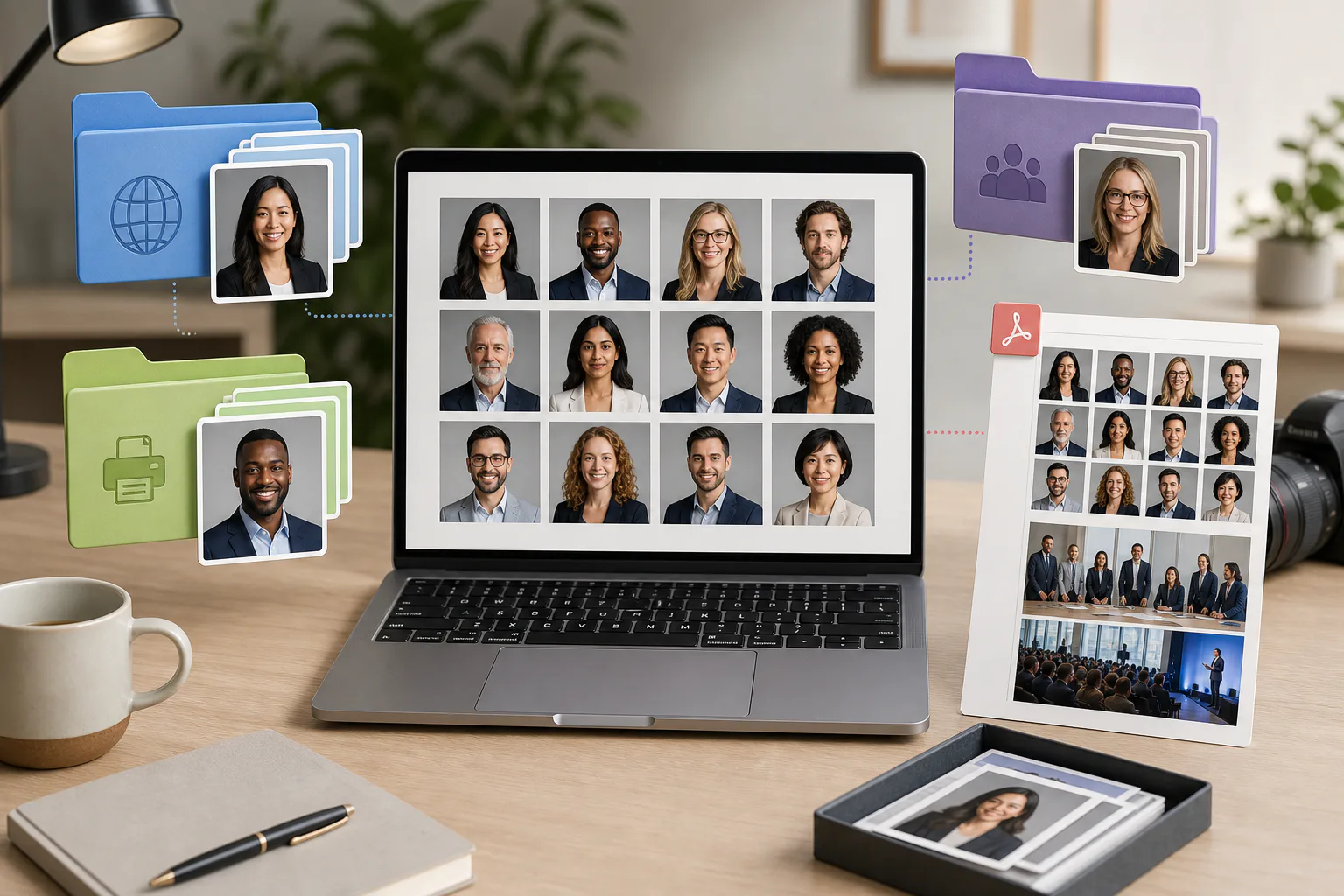
Once the images are ready, package them according to the people who will use them. A web producer does not need the same files as a print designer. A PR contact does not want to dig through originals, source files, and old edits.
A useful delivery folder might include:
- originals, untouched incoming files.
- web-square, final speaker-card images.
- agenda-portrait, taller images for bio pages.
- print, higher-quality images for program layouts.
- social-source, clean inputs for announcement graphics.
- review-pdf, contact sheets for approval.
Use image to PDF to create a quick visual contact sheet when a stakeholder needs to approve the set. A PDF review pack is easier to scan than a shared folder full of separate files. It also gives non-technical reviewers a stable artifact to comment on.
For a large event, create separate review PDFs by track, day, or speaker type. For example, keynote speakers, workshop speakers, panel moderators, and sponsor speakers can each have their own packet. This keeps approval manageable and helps catch missing portraits before publication.
Handle Late Speaker Submissions Without Breaking The Set
Late submissions are inevitable. The mistake is editing them in isolation. When a new headshot arrives, compare it against the existing approved set before exporting.
Use this short late-addition checklist:
- Does the source file meet the minimum size for the intended placements?
- Does the crop match the face scale of the current speaker grid?
- Is the background much brighter, darker, or busier than the others?
- Are all required versions exported with the same naming pattern?
- Was the review PDF or tracking sheet updated?
- Did the CMS receive the final compressed web file, not the original?
If the event is close to launch, define a minimum acceptable standard. For example, web square and agenda portrait may be required immediately, while print and social versions can follow. This prevents one late image from delaying the whole speaker page.
Common Mistakes To Avoid
The most common mistake is using the CMS upload as the editing step. Many content systems will resize images, but they rarely make thoughtful crop decisions. They may center-crop every image and cut off hair, shoulders, or glasses. Prepare the image before upload instead.
Another mistake is deleting the original after export. Keep originals until the event is over and the post-event archive is complete. Speakers may ask for a different crop, designers may need a higher-resolution source, or the print vendor may reject a small file.
Avoid mixing visual styles too aggressively. A fully transparent cutout beside a candid outdoor photo beside a studio portrait can make a speaker page look patched together. You do not need perfect uniformity, but you do need enough consistency that the page feels curated.
Finally, do not over-retouch. Event audiences expect real people. A slightly imperfect but authentic portrait is usually better than an uncanny image that looks detached from the speaker.
A Practical Speaker Headshot Checklist
Use this checklist when preparing a full conference set:
| Step | Done when |
|---|---|
| Collect originals | Every received file is saved untouched |
| Sort quality tiers | Risky files are flagged for replacement |
| Define crop rules | Square and portrait standards are documented |
| Clean distractions | Only technical, believable edits are applied |
| Resize outputs | Each placement has the correct dimensions |
| Convert formats | Web, print, and social files use suitable formats |
| Compress web files | Page assets are smaller without visible damage |
| Name consistently | Files follow one predictable pattern |
| Package folders | Web, print, social, originals, and review files are separate |
| Review as a set | The speaker grid looks consistent, not accidental |
For small events, this may take less than an hour once the rules are set. For large conferences, the same structure prevents a messy asset folder from turning into a publishing bottleneck.
Final Quality Pass Before Publishing
Before the speaker page goes live, view the headshots in the actual layout. A folder preview is not enough. The real page may crop images into circles, place names below them, or display three columns on desktop and one column on mobile.
Check the desktop speaker grid, mobile speaker grid, agenda detail pages, and any featured speaker modules. If the site uses lazy loading, make sure the images appear correctly as the page scrolls. If the CMS creates its own thumbnails, confirm that it did not choose a worse crop than the one you prepared.
Also check the printed program or PDF agenda separately. Print needs are less forgiving than web needs. A portrait that looks acceptable at 300 px wide on a website may look soft in a printed booklet. Keep the higher-quality print folder separate so it is not accidentally replaced with compressed web exports.
Speaker headshot preparation is a small production system, not a glamour edit. The best result is almost invisible: a clean speaker page, fast-loading images, consistent portraits, and no last-minute confusion about which file belongs where. With clear crop rules, restrained cleanup, smart resizing, and organized packaging, even a large conference lineup can look polished without wasting design time.