Transparent WebP Overlays for Help Center Tutorials: A Practical Field Guide
A practical guide for preparing transparent WebP overlays for help center screenshots, onboarding callouts, release notes, and product education without fuzzy edges or heavy files.

Transparent WebP Overlays for Help Center Tutorials: A Practical Field Guide
Transparent overlays are one of the quietest ways to make help center screenshots easier to understand. A good overlay can point to the right button, dim irrelevant parts of a screen, frame a setting, or show a before-and-after state without forcing the documentation team to rebuild the entire screenshot every time the interface changes.
The problem is that transparent assets are easy to make badly. A callout arrow exported with a pale fringe looks cheap on dark mode screenshots. A transparent PNG dropped into every article can quietly add megabytes to a page. A fuzzy overlay that looked fine in a design file can become muddy after resizing. A highlight ring that works on a white dashboard may vanish when placed over a colorful chart.
This guide is for documentation teams, product marketers, support leads, and small SaaS teams that publish many tutorial images but do not want to maintain a large design pipeline. The goal is simple: create transparent WebP overlays that stay crisp, stay light, and remain reusable across help center articles, changelog posts, onboarding screens, and product education pages.
We will cover where overlays help, when they make things worse, how to prepare source images, how to choose WebP versus PNG, how to clean edges, how to size files, and how to package overlay assets so they are easy to reuse later.
Why Transparent WebP Overlays Are Worth the Trouble
Most help center screenshots carry too much information. They show the product, navigation, empty states, real labels, panels, warnings, buttons, and sometimes the browser frame too. The reader is usually looking for one action: click this, check that, choose this menu, confirm that state.
Transparent overlays let you guide the eye without permanently changing the base screenshot. That gives you a few practical advantages.
First, overlays separate instruction from evidence. The base screenshot can remain a clean capture of the product, while the overlay carries the teaching layer: arrows, boxes, blur panels, masks, pointer dots, or highlights.
Second, overlays are easier to update. If a button moves slightly, you may only need to reposition or regenerate the overlay instead of recreating every annotated screenshot from scratch.
Third, overlays can reduce image clutter. Instead of baking four labels into the screenshot, you can use a single dimming mask and one strong highlight. This is especially helpful for mobile documentation, where labels and arrows can quickly crowd the screen.
Fourth, WebP often keeps transparent graphics smaller than PNG. That matters when a help article contains ten or twenty visuals. You can use ConvertAndEdit's /convert-image tool to convert PNG overlays to WebP, then use /compress-image to test whether the final asset still looks clean at a lower file size.
The benefit is not just page speed. Smaller image assets make editing, uploading, reviewing, and local backups less painful. For content teams that maintain hundreds of support articles, those small savings compound.
Where Transparent Overlays Actually Help
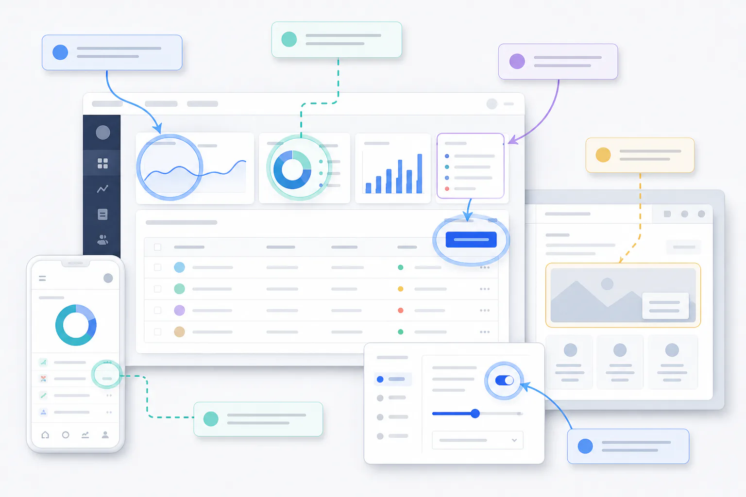
Transparent overlays are best when they clarify a screenshot without becoming the content themselves. They should help the reader understand the product state faster.
Common high-value uses include:
- Highlight rings around buttons, menu items, and form fields
- Dimming masks that push irrelevant UI into the background
- Cursor indicators for click targets
- Step markers for multi-part screenshots
- Cropped magnifier panels that float above dense settings pages
- Before-and-after comparison layers in release notes
- Reusable warning, success, or attention badges for tutorial images
They are less useful when the screenshot already contains a single obvious object. If the article says “Click Save” and the screenshot contains one large Save button, adding a bright arrow may only add noise.
They also become risky when the overlay communicates information that should be in real HTML text. For example, do not place long instructions, error explanations, or accessibility-critical details only inside a flattened image. The article body should still contain the important words. The overlay should guide attention, not replace accessible copy.
A Simple Decision Table
| Use case | Overlay recommended? | Better asset type | Why |
|---|---|---|---|
| Pointing to a small icon in a dense toolbar | Yes | Transparent WebP | Keeps the base screenshot clean while improving scan speed |
| Showing a complex form with three fields to complete | Yes, lightly | Transparent WebP plus written steps | Highlights help, but the article text must carry the instruction |
| Displaying legal, billing, or policy text | Usually no | HTML text or accessible PDF | Readers may need to copy, search, or zoom the exact wording |
| Reusing the same branded highlight style across many docs | Yes | Transparent WebP or SVG | WebP is practical for raster overlays with shadows or soft edges |
| Showing a product screenshot with no annotation | No | JPEG, PNG, or WebP screenshot | No transparent layer is needed |
The strongest use cases are small, repeated, and visual. If the reader benefits from being shown exactly where to look, an overlay is probably useful. If the reader needs to understand a policy, setting definition, or error message, write it as text.
WebP, PNG, or SVG: Pick the Right Format
Transparent WebP is not always the right answer. It is a strong option for many help center overlays, but format choice should follow the asset type.
Use transparent WebP when the overlay includes soft shadows, semi-transparent masks, blurred background fragments, anti-aliased highlight shapes, gradients, or raster effects. WebP can preserve transparency while keeping file size manageable.
Use PNG when you need maximum compatibility with a publishing system that does not reliably accept WebP, or when the asset is tiny and file size is already negligible. PNG is also a good temporary source format while editing because it is predictable and widely supported.
Use SVG for simple vector shapes such as arrows, rings, icons, and outlines, especially when the site already supports inline SVG safely. SVG can stay perfectly sharp at any size. However, not every CMS handles SVG safely or conveniently, and complex SVGs can become awkward for non-designers to maintain.
Use JPEG only for non-transparent screenshots or photographic source images. JPEG does not support transparency, so it is not suitable for overlays.
Format Comparison for Documentation Teams
| Format | Transparency | Best for | Watch out for |
|---|---|---|---|
| WebP | Yes | Soft masks, shadows, raster callouts, compact overlays | Some older systems may need testing |
| PNG | Yes | Source files, small overlays, maximum editor compatibility | Large files when assets are big or semi-transparent |
| SVG | Yes | Simple arrows, icons, rings, scalable shapes | CMS security rules and inconsistent rendering in some pipelines |
| JPEG | No | Full screenshots and photos without transparency | No alpha channel, compression artifacts around UI text |
A practical approach is to keep editable source files in the format your team can revise easily, export transparent PNG for review, then convert final approved overlays to WebP. If you need a final transparent asset quickly, /convert-image can handle the conversion step. If the resulting file is still heavy, /compress-image helps you test a smaller version before publishing.
Start With a Clean Base Screenshot
Overlay quality depends on the base screenshot. A sharp overlay cannot rescue a blurry capture, a cramped crop, or a screenshot with personal data still visible.
Before creating transparent callouts, prepare the base image.
- Capture at a consistent browser zoom, usually 100 percent.
- Use a clean demo account with stable sample data.
- Hide bookmarks, browser extensions, and unrelated tabs unless they are part of the instruction.
- Crop to the smallest area that still gives enough context.
- Resize only after deciding where the image will appear in the article.
- Compress after annotation, not before, unless the original screenshot is extremely large.
If you need a smaller screenshot for a help center layout, use /resize-image before building overlays so that your callouts match the final dimensions. If you resize after placing overlays, thin rings and arrows can become uneven.
For screenshots containing text, avoid aggressive compression. Thin UI text, table borders, and small icons fall apart quickly when compression is pushed too far. The screenshot and overlay should be tested together because a clean transparent ring can still look bad when placed over a noisy background.
Build Overlays as Separate Teaching Layers
Think of each overlay as a small reusable teaching layer. It should have a clear purpose and a predictable visual style.
For most help center images, you only need a small set of overlay types:
- A highlight ring for click targets
- A soft dimming panel for background focus
- A pointer dot for exact click locations
- A crop frame for zoomed-in details
- A simple arrow for direction or sequence
- A status badge for success, warning, or attention states
Keep these assets consistent. If one article uses thick red arrows, another uses blue circles, and another uses translucent yellow boxes, readers have to relearn your visual language. Consistency also makes the documentation feel maintained, even when screenshots come from different parts of the product.
A restrained overlay style usually works best:
- Use one accent color for action targets.
- Use a second color only for warnings or destructive actions.
- Keep shadows subtle so they do not create halos.
- Keep outlines thick enough to survive resizing.
- Avoid long labels inside the image.
- Do not cover the exact UI element being explained.
For product documentation, clarity beats decoration. The overlay should vanish from memory after it has done its job.
The Edge Quality Checklist
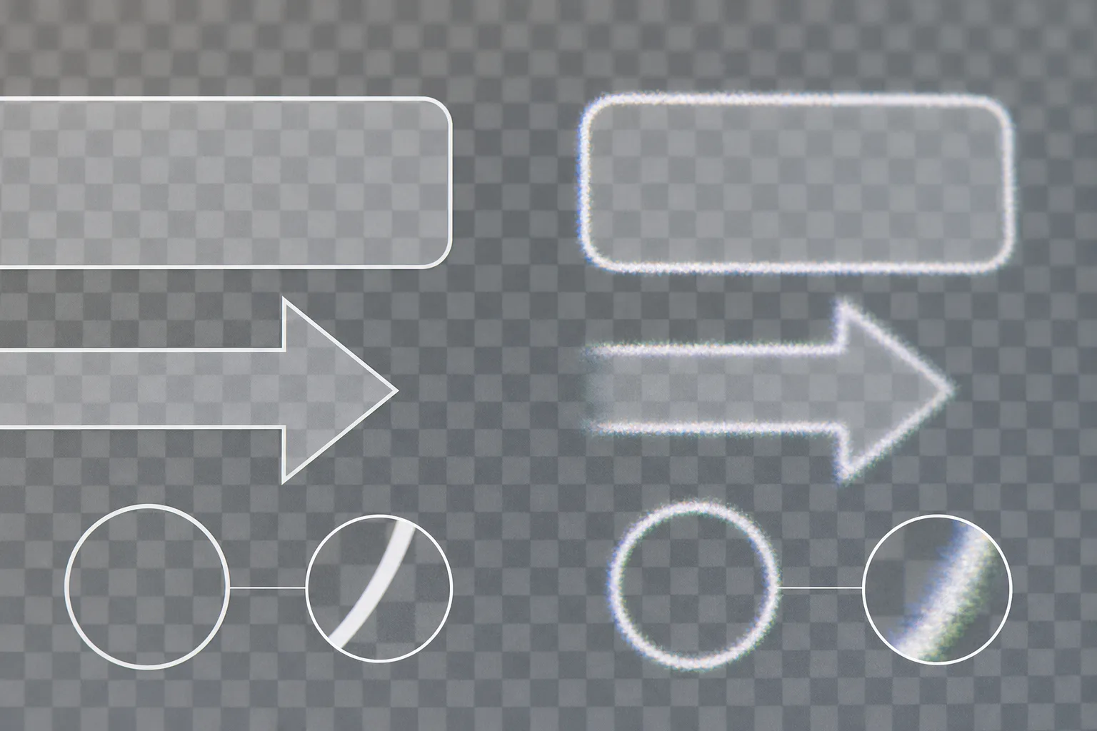
Transparency problems usually appear at the edges. The overlay may have a white halo, dark fringe, jagged curve, dirty semi-transparent pixels, or rough compression artifacts. These defects are especially visible when the same asset is used across both light and dark screenshots.
Use this checklist before publishing a transparent WebP overlay.
Check the Alpha Edge
Place the overlay on three backgrounds: white, dark gray, and a busy screenshot. If the edge only looks clean on white, it is not ready. White fringing often means the shape was cut from a white background instead of created on true transparency.
For marketplace-style product graphics or UI overlays, the same issue appears around icons, badges, and floating panels. If you need to remove or improve a background, /ai-photo-editor can help clean an asset before you convert or compress it.
Check the Stroke Thickness
Thin strokes disappear after resizing. A one-pixel ring may look elegant in a design app but become faint in a CMS column or on a high-density mobile screen. Use thicker strokes for tutorial overlays than you would for decorative UI.
As a rule of thumb:
| Final image width | Minimum useful overlay stroke |
|---|---|
| 320 to 480 px | 3 to 5 px |
| 600 to 900 px | 4 to 7 px |
| 1000 to 1400 px | 6 to 10 px |
These are not strict rules. The background matters. A ring over a dense analytics chart needs more contrast than a ring over a blank settings page.
Check Semi-Transparent Masks
Dimming masks are useful, but they can make screenshots feel muddy. A mask that is too dark hides context. A mask that is too light does nothing.
For most help center screenshots, a black overlay at 20 to 35 percent opacity is enough. For dark mode screenshots, use a light or colored focus treatment instead of adding more darkness.
Check Compression Around Curves
WebP compression can create slight roughness around curves and diagonal edges when quality is too low. This is more obvious on rings, arrows, and rounded rectangles than on rectangular masks.
Export a few quality levels and compare them at the final display size, not only at full size. If the overlay appears in a 720 px wide article column, test it there. A file that looks imperfect at 200 percent zoom may be perfectly acceptable in context.
Sizing Rules for Help Center Pages
Transparent overlays should be sized for the image they support. Oversized overlays waste bandwidth and invite scaling artifacts.
For static help center images, common target widths are:
| Placement | Typical final width | Notes |
|---|---|---|
| Inline article image | 640 to 960 px | Good balance for desktop docs and mobile scaling |
| Mobile-focused tutorial image | 360 to 540 px | Use thicker callouts and less text inside the screenshot |
| Release note visual | 900 to 1400 px | Useful for product pages and changelog cards |
| Thumbnail preview | 320 to 600 px | Keep overlays bold and simple |
If the overlay is exported separately from the base screenshot, it should match the screenshot's pixel dimensions exactly unless your publishing system positions layers with CSS. For most teams, flattening the base screenshot and overlay into one final WebP is simpler. But keeping the overlay file separate in your source folder still helps future edits.
A practical file naming pattern looks like this:
billing-settings-base-1440.png
billing-settings-highlight-plan-field-overlay.webp
billing-settings-final-docs-960.webp
The base file stays editable, the overlay remains identifiable, and the final article image is clearly marked for publishing.
Creating the Final Composite
Some teams publish true layered overlays in the browser. For example, they place a transparent WebP above a screenshot with HTML and CSS. That can be powerful, but it adds layout complexity and can break if the image is resized without matching overlay rules.
For most help center articles, a flattened final composite is safer. You keep the overlay editable in your source folder, but publish one final image in the article. This reduces the risk of misalignment, improves CMS portability, and keeps the article easier to maintain.
A simple production path looks like this:
- Prepare the base screenshot.
- Resize the base to its intended article width with /resize-image.
- Create or place the transparent overlay at that exact size.
- Export a review image as PNG if needed.
- Convert the final composite to WebP with /convert-image.
- Compress a copy with /compress-image and compare the result.
- Keep the source, overlay, and final asset in a small folder together.
If the tutorial needs a printable version, you can also collect final images into a PDF using /image-to-pdf. That is useful for internal enablement sheets, sales engineering notes, or support training packets where the same visuals need to leave the CMS.
Accessibility and Readability Rules
Image overlays should make documentation easier to use, not harder to understand.
Do not put essential instructions only inside the overlay. If the image disappears, fails to load, or is read by someone using assistive technology, the article should still make sense. The surrounding text should describe the action clearly.
Write alt text for the final image that explains the purpose, not every visual detail. For example:
Account settings screen with the plan selector highlighted.That is more useful than:
Screenshot with a blue circle and arrow.The reader needs to know what the image is showing. The overlay style is usually secondary.
Also consider color contrast. A red ring may stand out, but it can also imply danger or deletion. A yellow highlight may vanish on pale interface backgrounds. A blue highlight may blend into many SaaS dashboards. Test overlays on real screenshots before turning a style into a standard.
For color-dependent states, add shape differences too. For example, use a ring for the target action, a dashed outline for optional areas, and a solid warning frame for destructive actions. Shape helps readers who cannot rely on color alone.
Common Mistakes That Make Overlays Look Amateur
The most common mistake is exporting from the wrong background. If an overlay was created on a white canvas and then the white background was removed later, pale pixels often remain around the edge. Always create overlays on true transparency when possible.
Another mistake is using labels inside the screenshot instead of writing clear article steps. Labels become hard to translate, hard to update, and hard to read on mobile. If a label is necessary, keep it short and repeat the instruction in the article body.
A third mistake is using too many callouts. Three arrows, two boxes, and a dimmed background often make the reader slower, not faster. If you need to explain five regions of a screen, split the tutorial into multiple images.
A fourth mistake is compressing the final image until the base screenshot text blurs. Documentation images are not decorative banners. The reader may need to inspect field names, menu labels, and settings. Protect legibility first, then reduce file size.
A fifth mistake is mixing styles from different tools. One screenshot has rounded yellow labels, another has neon arrows, another has thick red boxes. Decide on a small overlay set and reuse it.
A Practical Asset Audit Before Publishing
Before adding a new transparent overlay image to a help article, run a quick audit. This takes less than two minutes per asset once the team knows what to look for.
| Check | Pass condition |
|---|---|
| Purpose | The overlay points to a specific action or state |
| Edge quality | No visible white, black, or colored fringe on light and dark backgrounds |
| Legibility | Screenshot text remains readable at article width |
| File size | Final image is small enough for the page without obvious artifacts |
| Accessibility | Article text explains the action without relying only on the image |
| Consistency | Color, stroke, and shape match the team's existing tutorial style |
| Maintenance | Source, overlay, and final export names are clear |
If an asset fails two or more checks, revise it before publishing. Small defects are easy to ignore in a single article, but they become visible when readers move through a whole help center.
Example: Updating a Settings Article Without Rebuilding Every Screenshot
Imagine a help article that explains how to change notification preferences. The product team moves the notification toggle from the bottom of the page to a right-side panel. The article has six images, but only two need strong visual guidance.
A practical update would look like this:
- Capture a new base screenshot of the settings page.
- Resize it to the same article width as the previous image.
- Place a dimming mask over the irrelevant left navigation.
- Add a highlight ring around the notification panel.
- Export the final composite as WebP.
- Compress and compare it against the previous version.
- Update alt text to mention the new panel location.
You do not need to redesign the whole article. You need a clean base screenshot, a reusable overlay style, and a final image that loads quickly.
This is where transparent overlays become valuable for small teams. They reduce the cost of keeping documentation visually current without forcing every support article through a full design pass.
When to Skip Transparent WebP
Transparent WebP is useful, but it should not become a default answer for every visual problem.
Skip it when a plain crop would do the job. If the reader only needs to see one small settings panel, crop to that panel instead of covering the rest of the screen with a mask.
Skip it when the publishing platform already has strong native callout components. HTML callouts, expandable steps, and accessible annotations may be easier to maintain than image-based overlays.
Skip it when the image will be printed often. WebP support in print-oriented tools can be inconsistent, depending on the system. In that case, keep a PNG or PDF version available.
Skip it when the screenshot contains sensitive information that has merely been covered by an overlay. Covering private data with a transparent layer is not redaction. The underlying pixels may still exist in the source or layered file. For sensitive screenshots, create a properly sanitized final image and keep private originals out of shared folders.
Final Publishing Checklist
Use this final checklist before the article goes live.
- The H1 and surrounding article text explain the task without relying on image text.
- Each screenshot is cropped to the smallest useful area.
- Overlays use consistent colors, strokes, and shapes.
- Transparent edges look clean on light, dark, and busy backgrounds.
- The final image is exported at the exact intended display size or slightly larger.
- The WebP version has been compared against the source at real article width.
- Alt text describes the product state or action being shown.
- Source files are named clearly enough for a future editor to revise them.
- No sensitive data is hidden only by a removable layer.
The Main Takeaway
Transparent WebP overlays are best treated as small teaching assets, not decoration. They help readers find the right part of a screenshot, reduce visual noise, and make documentation updates less painful. The difference between a polished overlay and a distracting one usually comes down to a few basics: clean transparency, readable strokes, restrained colors, sensible compression, and clear file naming.
For teams publishing product education at a steady pace, the practical system is simple. Prepare a clean screenshot, create one purposeful overlay, test the edge quality, convert the final image to WebP, compress carefully, and keep the source files organized. Done consistently, that gives your help center images a sharper, faster, and more maintainable visual layer without requiring a heavy design process.